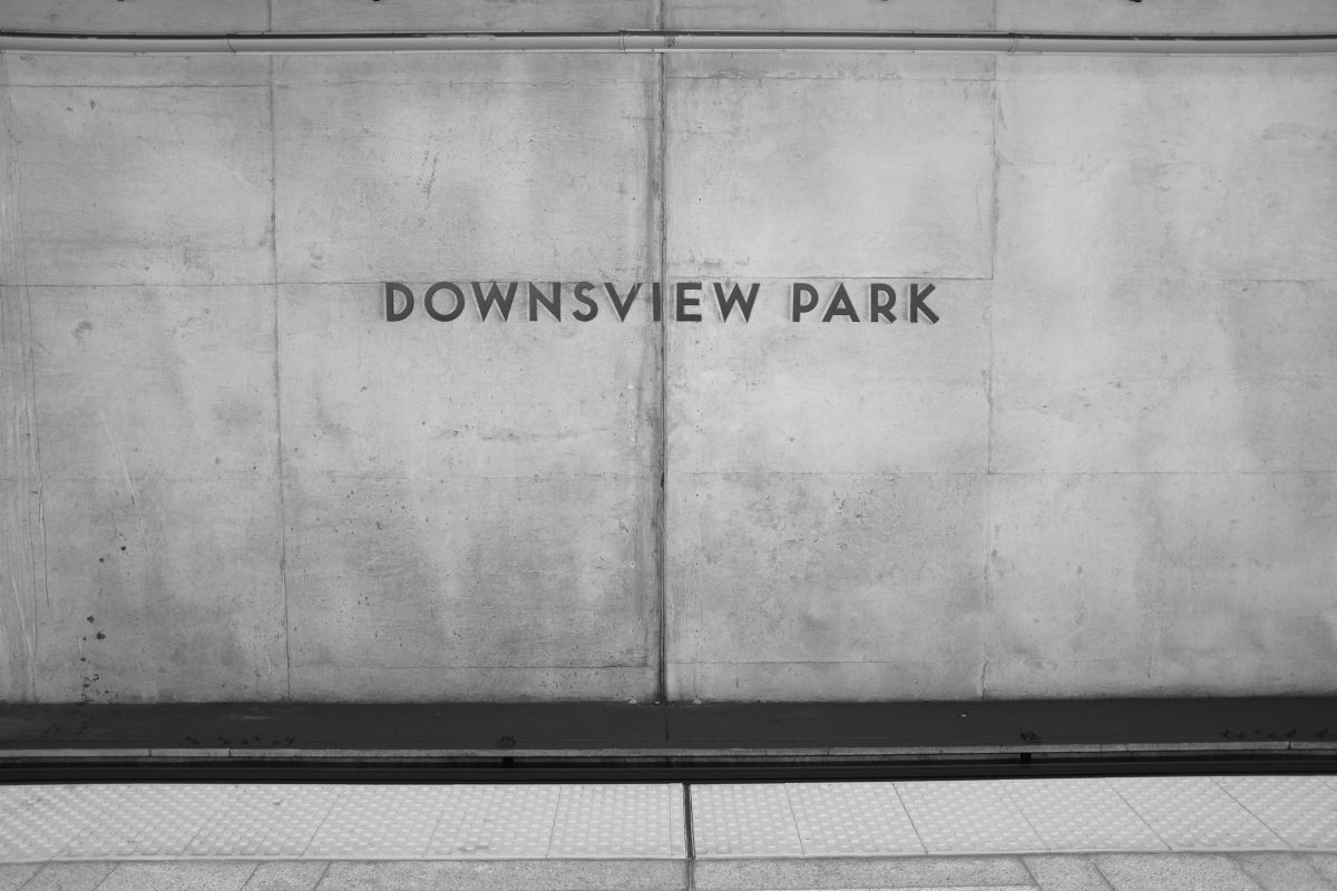
Posts Tagged: photography
2 a.m. Cortisol Cloud
Insomnia
I am normally a pretty good sleeper. Most nights I get in bed, I read until my eyes will no longer stay open and then get a decent rest. If I do wake up, it is just for a few moments and then I shift my body and fall back asleep. But sometimes I go through cycles where I wake up around 2 or 3 a.m. and can’t get back to sleep easily. This wakefulness can last an hour or more and I usually end up pretty exhausted by the next morning. This can happen everyday for a week or so and then suddenly stop.
Recently I saw a video where a sleep specialist was discussing the hormone cortisol. Cortisol is produced by the body in reaction to stress. The very common 3 a.m. sleep disturbance is often caused by a high level of cortisol at a time when it should be at its lowest point in the day. The result: a person under stress awakens and becomes mentally active when they should be in deep sleep. Stress is a major factor in this cloud of cortisol but there are many other factors too…like lack of exercise. I won’t go into them all here. I will only say that, of all these influences, stress levels are probably the most difficult to control.
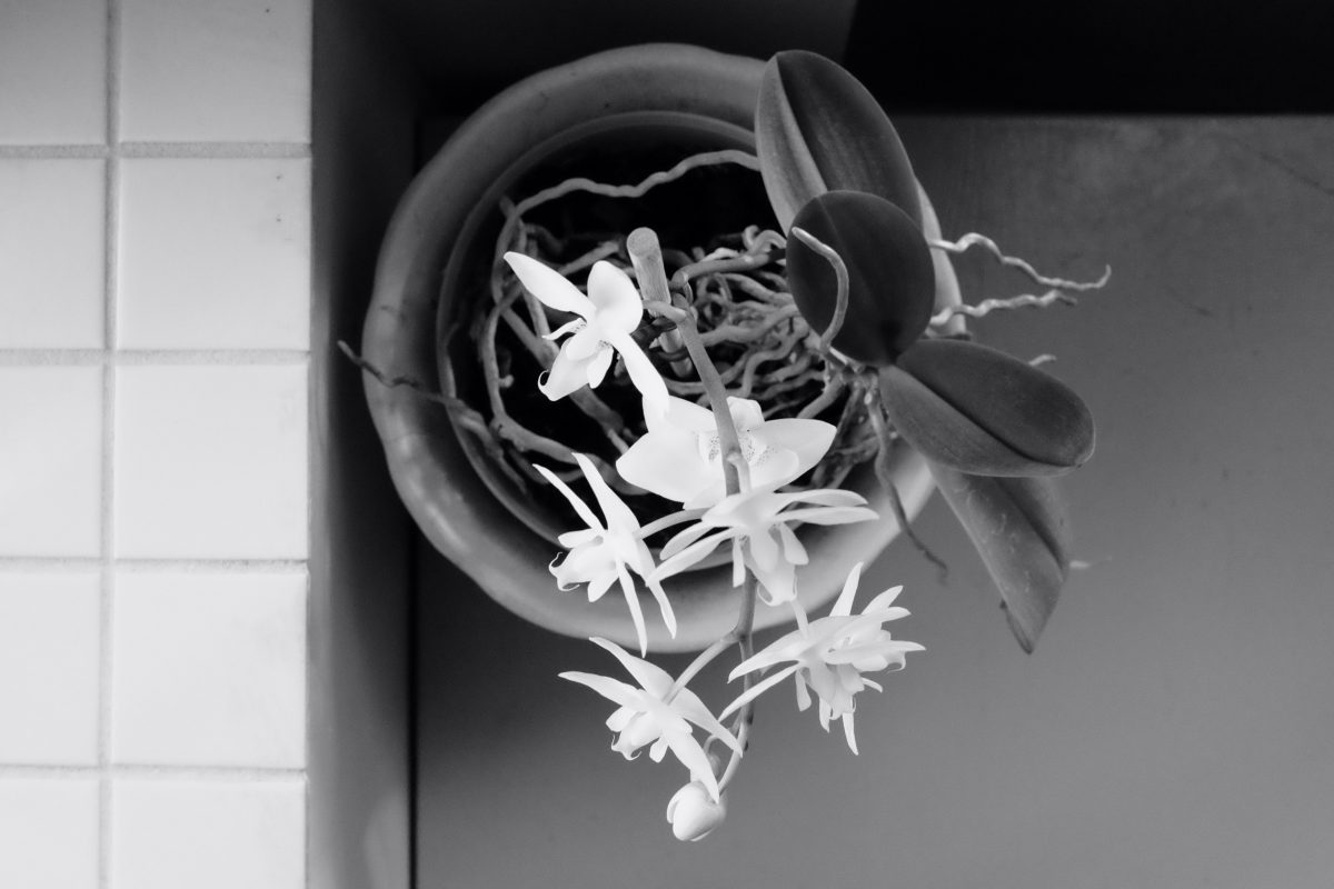
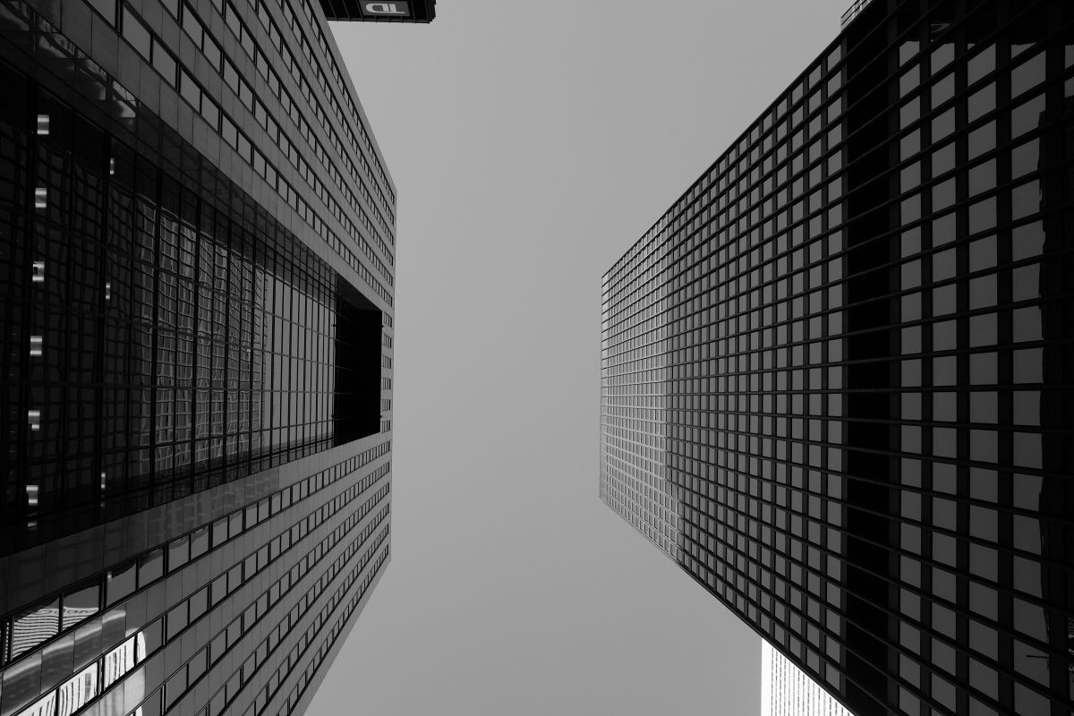
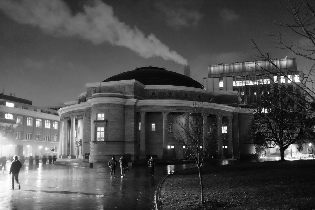
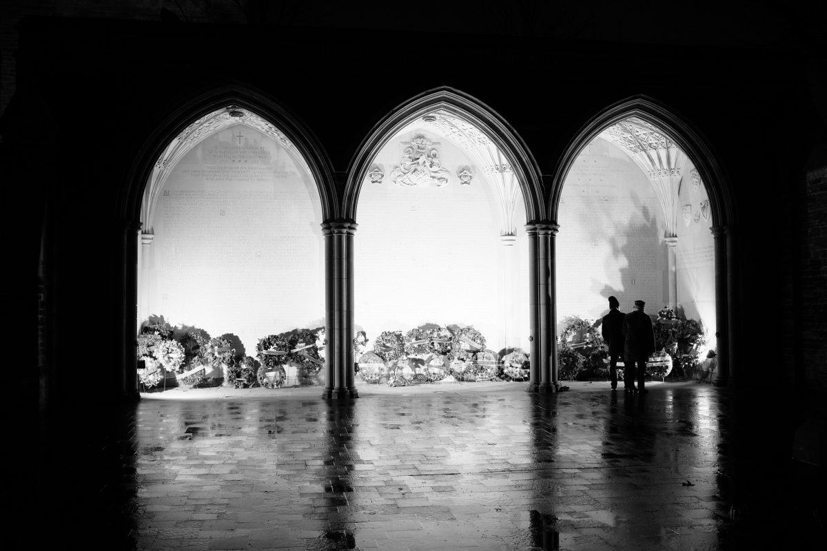
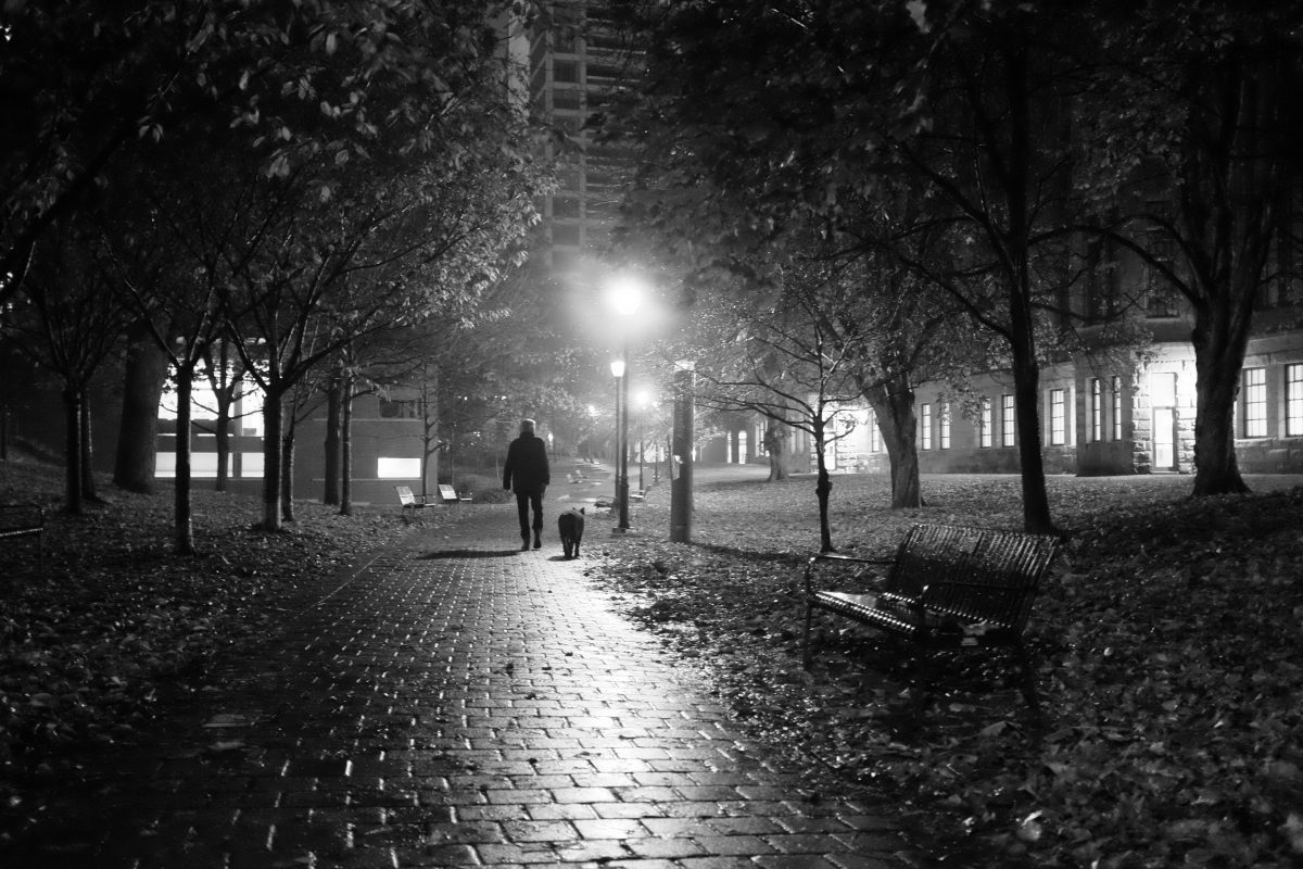
The photos…
I am going to insert a few pictures into this post. They may or may not be related to what you are about to read but I like them and want to share them here anyways. Think of them as images from dreams.
These days…
…I am past the end of a kind of planned sabbatical period. Sometime ago, I decided to take a year off and pursue a new path. I had saved enough money to make this possible so I didn’t have to stress too much about it. It was simply a decision I had made and one I was following through with. But, as the end came around, the money started to run out and I am now forced to figure out a way to make some more. I either have to get a new job or create my own stream of income. Without going into details, I will just say that this is very stressful and it occupies most of my thoughts.
About last night
Not surprisingly, this stress is affecting my sleep in exactly the way I described above. Yesterday was a day that, for all my hard work and good intentions, was completely unproductive and exhausting. I got in bed early just to escape the day. I wrote a little bit and then read a book until I fell into a sound sleep.
At 2 a.m., I woke up suddenly and I knew that I was at the start of a cycle of stress induced awakenings. Sometimes I fight this by just laying awake and trying to calm my racing thoughts…this is least effective solution. Other times, I flick on the light and read until I fall asleep. This is like a “start over from the beginning”. The success of this method really depends on just how wound up I am. The third method (which I used last night) is to try to get whatever thoughts are swirling around in my skull OUT. I do this by writing them down on paper or, like last night, typing them into the notes app on my phone.
Usually, these writings read like a kind of garbage dump of thoughts and feelings. But this morning, when I read over what I had typed half-consciously in the middle of the night, I thought it might be worth preserving. At least for myself. Below is the unedited late night mind-emptying transcript:
2 a.m. Cortisol Cloud
“I just woke up at 2 am and these are my mostly unfiltered thoughts about starting a business and/or getting a job….the thoughts that woke me up in the first place:
The main thing is…the thing that has kept me from getting started…is that I don’t think that I am worth investing in. At least not right now.
People around me tell me that I am smart. They tell me that I have talent. That I am creative. That I am organized. That I can do anything. But I don’t or I can’t believe them. And when I try to avoid “negative self-talk” and prop myself up, I don’t believe myself either. It all just feels like a lie.
I like this life that I am living right now. Cooking for myself, exercising, reading, studying, playing with my cat, taking pictures, going for long walks, meeting friends, playing music, writing my stupid blog. I am taking good care of my body and my mind. And I don’t waste time. It’s enough for me, really. I wish it didn’t cost so much.
I don’t want to be rich. I don’t need anything more than what I have. I don’t want to own anything. I just want to be able to choose how I spend my time. This is freedom and peace to me. But I know that this dream that I am living at the moment is impossible to sustain. And that is hard to swallow.
This feeling will subside…. In the depths of my heart, I am an optimistic person and I am happy to be alive.
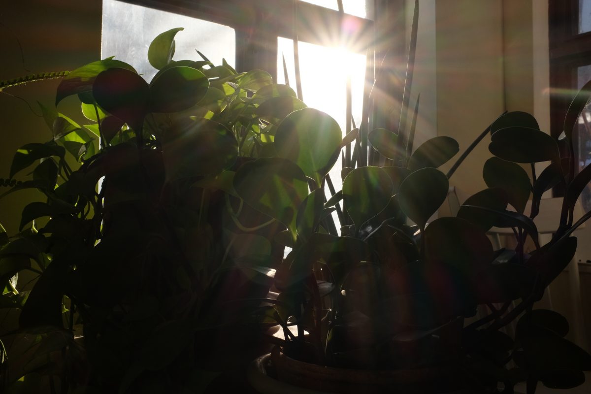
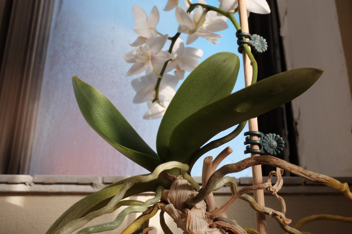
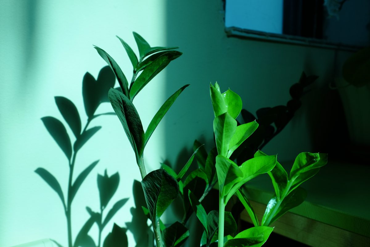
These February mornings, sunlight, diffused by the icy glass of my tall window, casts soft shadows of houseplants on the chipped and crooked old walls of my room…and that is enough to raise an honest smile…that sun penetrates my heart and happiness warms me from the inside out. I try my hardest to capture the light in a photograph (almost impossible!) But, if I get it just right, I can trap that warm feeling in an image and return to it whenever i want to. It works.
If you read this, please don’t worry about me too much. I am not depressed…I just don’t like myself that much right now. It is not the same thing.
In the meantime, I will look at my hands and move my fingers one by one like Kim Sae-Byuk in “House of Hummingbird”. I know that it is ok to hate myself for a time, and I will try to focus on the small things that I can control.
When is someone going to invent a cigarette that doesn’t kill you?”
Afterward
After I finished writing that in bed last night, after I had emptied my mind, I slept pretty well. What I wrote is accurate. It is all true. Although, awake during the day, I would have a hard time expressing thoughts like that. In the twilight between sleep and wakefulness, I think that we enter a kind of drunk state. We think and say what we mean without filtering, without inhibition. I think there is truth and value in recording dark thoughts in dark hours.
When someone gets drunk and tells you something like “I have always really been attracted to you” and the next day apologizes and says “I was really drunk. I didn’t really mean it”…the truth is more like: “What I said was true, I just shouldn’t have said it”. To me, your nighttime thoughts are kind of like the drunk’s confession. You can learn something about yourself here. Something true and honest.
How to get to sleep
Probably very few people know this, but when I was in University, I studied and wrote my thesis on sleep. The University I attended had one of the most famous sleep labs in the world and I wrote a paper on a tiny electrical impulse that can be stimulated during sleep: “the P1 evoked potential”. If you are not studying neuro-psychology, this paper would bore you to death. In fact, reading my paper itself would probably be a pretty good sleep inducer for anyone!
I am not a sleep expert in any way but over the years I have learned a few tricks that work for me, your average occasional insomniac without any serious mental conditions. Here are my two favourites:
1- Controlled deep breathing. This might be a 4/8 breathing method, “square breathing” or any number of other breathe-to-relax methods . It is basically learning to control your sympathetic and parasympathetic nervous systems through intentional slow breathing. It is incredibly effective in controlling stress anytime day or night but it takes practice and focus. It is not easy. Kind of like meditation…you need to apply it consistently and practice it often. There are hundreds of videos online about this and some good books too. I recommend “Breath” by James Nestor. This is a simply written and well researched book on the way we breathe and how it effects everything in our lives.
2- Psychotherapist Viktor Frankl’s Logotherapy uses “paradoxical intention”, where a patient consciously intends to do exactly that which he fears in order to overcome the fear itself. In terms of sleep….someone who lays in bed worried about falling asleep will probably not fall asleep very easily. Hyper-intention to fall asleep keeps the person awake. Frankl recommends trying the opposite. Get in bed and forget about falling asleep. Instead, make it your intention to stay awake as long as you can. Decide now that you will NOT sleep and fight the urge as hard as you can. If you do this, you will most likely find yourself in deep sleep pretty quickly…just by removing the intention. Try it. Grab a book or start a movie and think to yourself: “There is no way I am falling asleep until I finish this”. ZZZZzzzzzzz…
p.s. If you haven’t seen the film “House of Hummingbird”, I highly recommend checking it out. It is one of my favourites. I think you can stream it almost anywhere.
If you want to learn more about Viktor Frankl, pick up his book “Man’s Search for Meaning: An Introduction to Logotherapy”. It documents his experiences as a prisoner at Auschwitz and how the experience shaped his approach to psychotherapy. It is a very short and fantastic read, not nearly as heavy as the title would make you think.
If you have any questions or comments, please leave them below. I always look forward to hearing from you. If you enjoy the content and would like to contribute towards website maintenance and development, you can make a donation here. Thanks for reading TigerSalad!
Post Post-Script
A day after posting this I got a few private messages from friends doing a subtle mental-health check-in. To those who got in touch: a sincere thank you. I am actually doing ok but I truly appreciate the contact. It is always a warm feeling when you realize that people care about and think about you. I wish more people would check in with friends who might need some support…sometimes lives hang in the balance.
When I wrote this, I didn’t mean for it to come across as something too heavy. All I meant to get across is that sometimes your subconscious is sending you messages that are worth listening to. They may come in dreams (harder to interpret) or they may come more directly in that twilight between wakefulness and sleep. For me in this case, here is what I understand as the message from me to myself:
“Although during the day you seem to enjoy the quiet contemplative time that you have no shortage of…in reality you are unsatisfied with your life and you don’t like (or maybe you are bored with) the person you have become. Find the courage to take a step forward.”
In other words…time to wake the fuck up and do something : )
That’s my best one line summary.
I think it is quite normal be be unsatisfied with yourself, even to hate yourself on some level sometimes. It can be a catalyst for positive change and, in my case, erase a false sense of well being. You just have to recognize it for what it is, accept it, accept that it is not permanent, and keep passing the open windows.
Pay attention to messages from your subconscious…even if they are dark. They are a part of you and you can learn something from them.
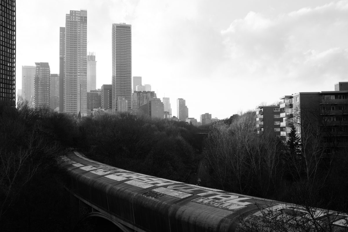
Winter Solstice
The shortest day
December 21st is the shortest day of the year. Daylight shrinks to barely 9 hours with sunrise just before 8 am and sunset just before 5 pm. I know I am not the only one who feels the weight of this time of year. Many people I know seem to enter some kind of seasonal depression, sometimes (but not always) tempered by Christmas festivities.
Toronto is a lovely city for the three warmer seasons but not so much in winter. From now until spring the sun rarely shines and the occasional bright morning inevitably turns to gloom by the afternoon. Most years, there is not much snow in the city and winter temperatures tend to fluctuate above and below the freezing point. Snow quickly melts into salty, grimy pools that later freeze into sheer ice. Sometime in the new year, Toronto enters a deep freeze that lasts anywhere from a few weeks to a couple of months. These cold days can bring sunlight but it doesn’t last for long and the city soon sinks back into murky grey.
When traveling, sometimes people ask me what Toronto winter is like. I am sure they are imagining crisp cold air and bright blue skies meeting a sparkling white horizon. I am always a little sad to tell them that, at least where I live, it is mostly salt crusted dirty streets, grey days and long dark nights.
Winter Blues (except when it snows)
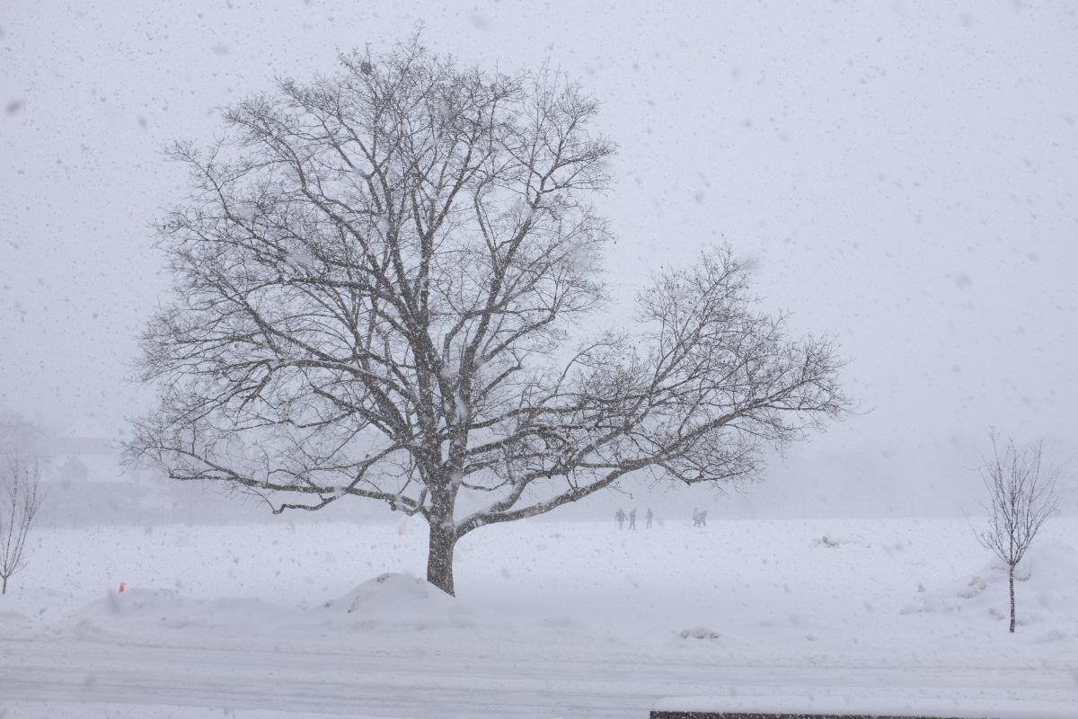
Even though I live in this colourless city, I can still enjoy winter. The cold doesn’t bother me, and of all the natural phenomenon in the world, I am always deeply moved by the magic of a big snowfall. Every time. I love the way it mutes the city noise and how it transforms the urban landscape into something soft and beautiful. I can’t think of too many things that make me happier. Unfortunately, it doesn’t usually last very long before the next melt cycle.
Deep in the typical gloom of Toronto winter, I have a hard time seeing anything that I want to photograph and writing becomes a lot more difficult. Creativity shrinks back. I tend to retreat into reading books, watching films, listening to and learning music and language studies. A lot of input, not much output.
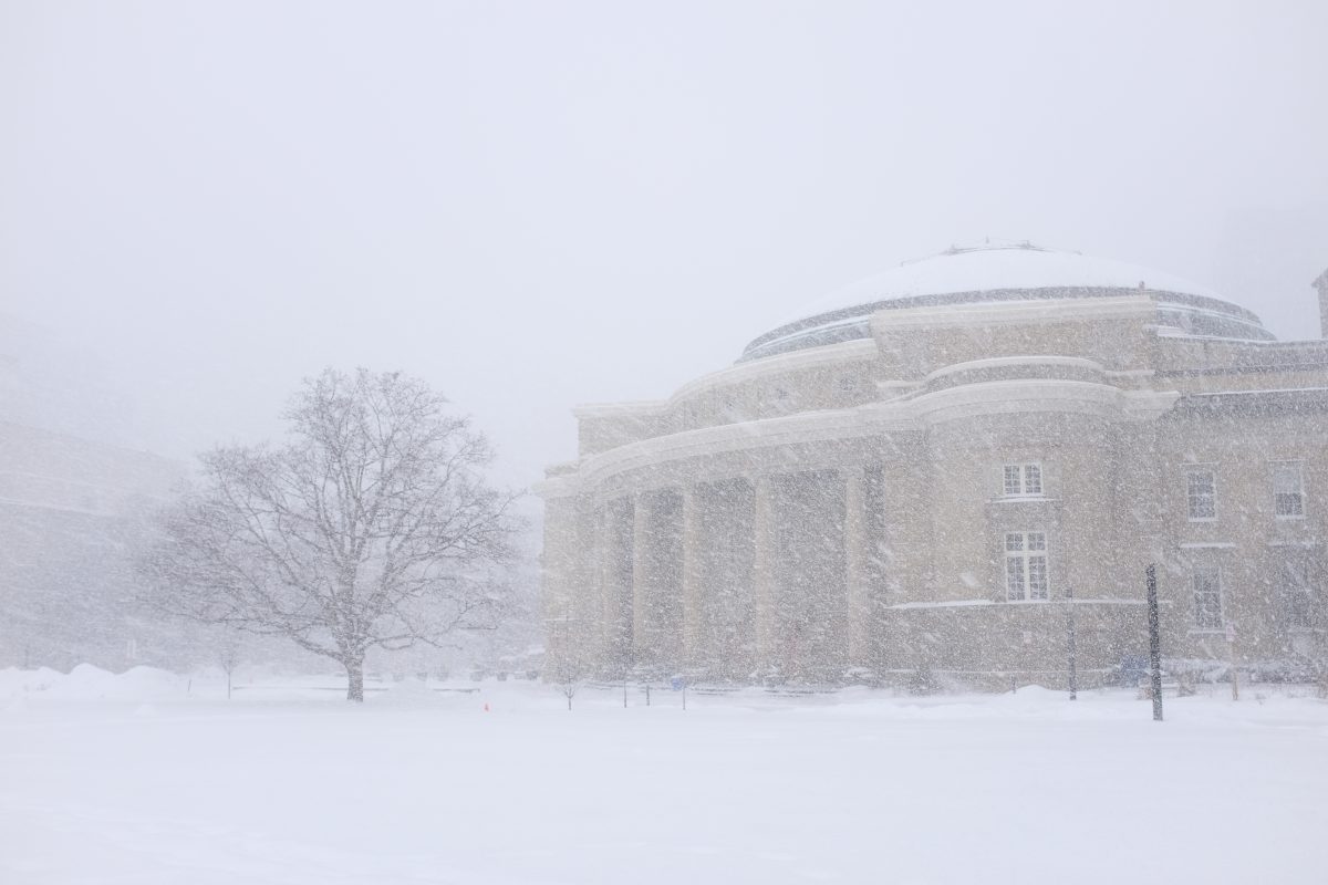
From spring to fall I was writing on here at least once every two weeks and I had so many pictures that I sometimes had trouble organizing them. Lately I have been doing less creative writing. And I have not wanted to pick up my camera as much but, I have taken a few pictures that I like. I will post them up here with no other purpose than sharing a few good, mostly unrelated, shots.
2025 in review
For a long time, I had planned to take a year off from work and 2025 was it. Originally I thought I would get right into planning my next career move but, instead, I was flooded by the desire to create and to learn. Not in any organized way…just to follow threads as they appeared and to accept and act on ideas and inspiration without any resistance and with the least amount of judgement possible. The result was a ton of writing.
This website started as a travel diary for an early spring trip to Japan and Korea that I took with my daughter. Sick of all the trash and advertising on social media, I thought this would be a fun alternative. In the end, it became something I loved doing and something I am quite proud of. I still revisit the trip quite often. The photos are good and the articles are fun and pretty well written.
When I got back, I wanted to keep writing and TigerSalad became a place for me to document photo projects, recipes, articles, ideas and sounds…all things I used to dump (in some compromised way) onto social media. On here, I rarely involve my phone and I can write as much or as little as I like. To date, I have written over 70 articles.
Surprisingly, TigerSalad has done ok. I get a decent amount of traffic and I know that the people who are visiting are interested in what I am doing rather than getting directed here by some stupid algorithm . I don’t link ads or pop-ups and so, I make zero income from it. Fine with me! Instead, I have a discreet donation link where people can send me some dollars which I put into website maintenance if they enjoy the articles. Even though I had zero expectations, a few generous amounts came through in the first few days. Thank you!!
On top of those 70 or so website entries, I have been doing other writing on the side. I have started some long form fiction (in other words, a book). Whether or not it ever gets finished or sees the light of day is not so important to me. I just enjoy writing it and learning about the inner lives of my characters as they unfold. I like the people in the story. They make me laugh and I care about them and I want to know what happens next. That is enough for now.
In the last few months, I have also picked up a few paid jobs doing copy writing: captions for social media projects and website copy. I really enjoy this work. I will labour for hours choosing the sharpest word, the most effective sentence, the most concise and economical phrase where necessary. To me it is like solving a puzzle. I love it. And, I do it all facing my big windows with a hot coffee and a sleeping cat on my desk. It is like a dream and I wish I could keep doing it. Let’s see what happens…
Christmas is coming…
I have a few close friends who are sincere Christians with a strong connection to their church and community. Christmas has a deep spiritual meaning for them. It is a time for celebration. The effort and joy that they put into this season is awe inspiring. It is fun to witness and some of their energy definitely rubs off on me.
As for me, I was mostly raised without any religion. Czechs, along with Japanese and Chinese are among the worlds least religious people. My family never went to church and religion was never a topic of conversation. Christmas was important but it centered entirely around family.
When I was very young, my parents (barely 20 years old) were new immigrants to Canada with no family here at all. I don’t remember too much of those days. I think our Christmases were probably more like house parties with lots of music, drinking and smoking with me sleeping in a pile of fur coats on a bed somewhere. But, over the next few years, my family began to grow as my parents began sponsoring their brothers and sisters to move to Canada.
At some point in my early adolescence, our family was suddenly huge. Aunts, uncles, cousins, friends, everyone gathered at our house for the Christmas season. For around a week between Christmas and New Years Day, our house was packed with aunties cooking and baking and uncles smoking and drinking and talking non stop. Food was everywhere. People slept over and stayed for days. One meal would blend into the next. Endless packs of cigarettes would burn to ash over hours and hours of card playing and laughter. To me, it was heaven. I can’t remember a time when I felt more warmth and happiness.
Of course, as years pass, time takes its toll and my once huge family Christmas has all but disappeared. Death, disease, divorce and relocation for work have all played a part in chipping away at the giant celebration of the past. These days, Christmas is always coloured with a little sadness. I miss that huge family made up of the people I have loved the most. I especially miss my uncles who have died, the ones who worked awful jobs and had nothing, but would still manage to tuck a few hundred dollar bills into my pocket every Christmas. XOXOXOXO.
These days, my family is very small. Still… we have our Christmas rituals, we eat our turkey dinner, exchange a few gifts and enjoy the love and warmth of the season. We are lucky to be able to do so. Although Christmas arrives with a little sadness and a little loneliness, I still look forward to it and feel fortunate to spend the hours with people that I love. Merry Christmas!
Best Christmas Song: “The Christmas Song” Nat King Cole (chestnuts roasting on an open fire..)
Best Christmas Food: Turkey (brined)! Stuffing (must have bacon or sausage)! Cranberries!
Best Christmas Movie: “2046” Wong Kar Wai. Not exactly a Christmas movie but a lot of its key moments happen at Christmas. It is really my favourite movie. I watch it once a year at night on the 25th.
Upcoming Projects
Although I haven’t posted up anything lately, I have been busy photographing and documenting a few fermentation projects. My apartment is cool in winter so it is a perfect time for long ferments. I have a batch of 2 stage makgeolli (Korean rice alcohol) that is almost done. A detailed recipe with tons of pictures and sounds will go up soon. I will also be fermenting pears, first into alcohol and then into vinegar. This will take well over a month but it is in the works.
TigerSalad has a fair amount of recipes and I use them all the time. Originally, I had recipes scribbled down all over the place on loose paper and the backs of receipts etc… I started putting the recipes on here because I wanted to make an online cookbook for myself so I can have everything in one place. I really dislike cooking from videos, and most online recipes have too much filler and way too many ads and pop ups. My recipes are designed to be clear and logical, with lots of photos to make even complicated things doable. Try them…they work.
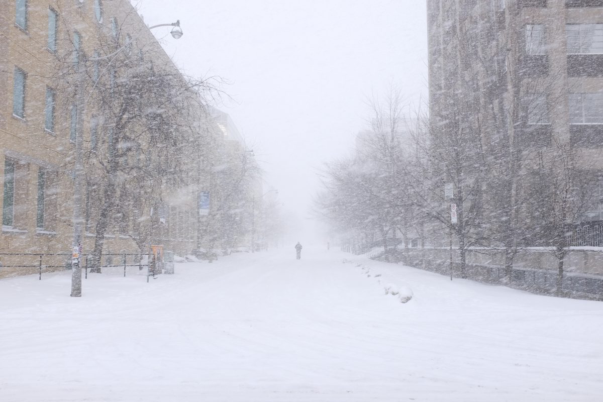
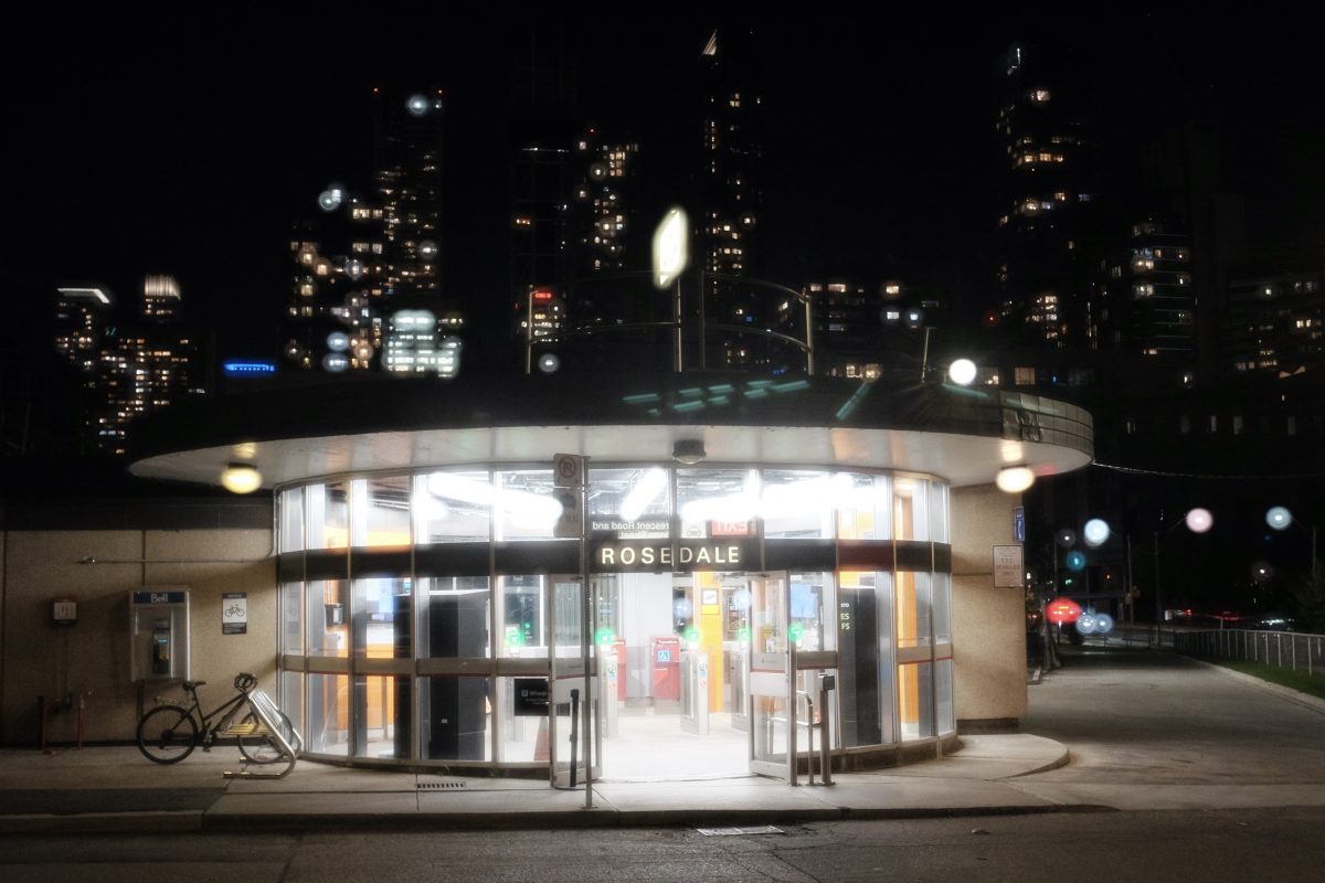
Winter Photos
I hope it snows soon. Big snow. Lots of it. I am looking forward to getting out in the city with my camera and capturing Toronto in some of its handsome winter moments. Like this one in St James Town last year:

Big City Winter Survival Tips:
1-Go outside! It’s not as cold as you think and the more you go out the more you will get used to it. There is lots of oxygen and less pollution in heavy cold winter air. It is energizing.
2-Don’t try to look cool or fashionable in winter. Just dress up in warm layers of clothes. Unless you are very wealthy, it is hard to be warm and look cool at the same time. Just give up!
Happy holidays from TigerSalad! See you soon with a home made booze recipe just in time for New Years!
If you have any comments, questions or suggestions please leave them below. I look forward to hearing from you. It is the only way I know you have been here…other than vague stats from Google : )
If you enjoy the content and would like to contribute towards website maintenance and development, you can make a donation here.
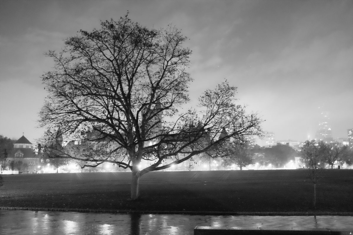
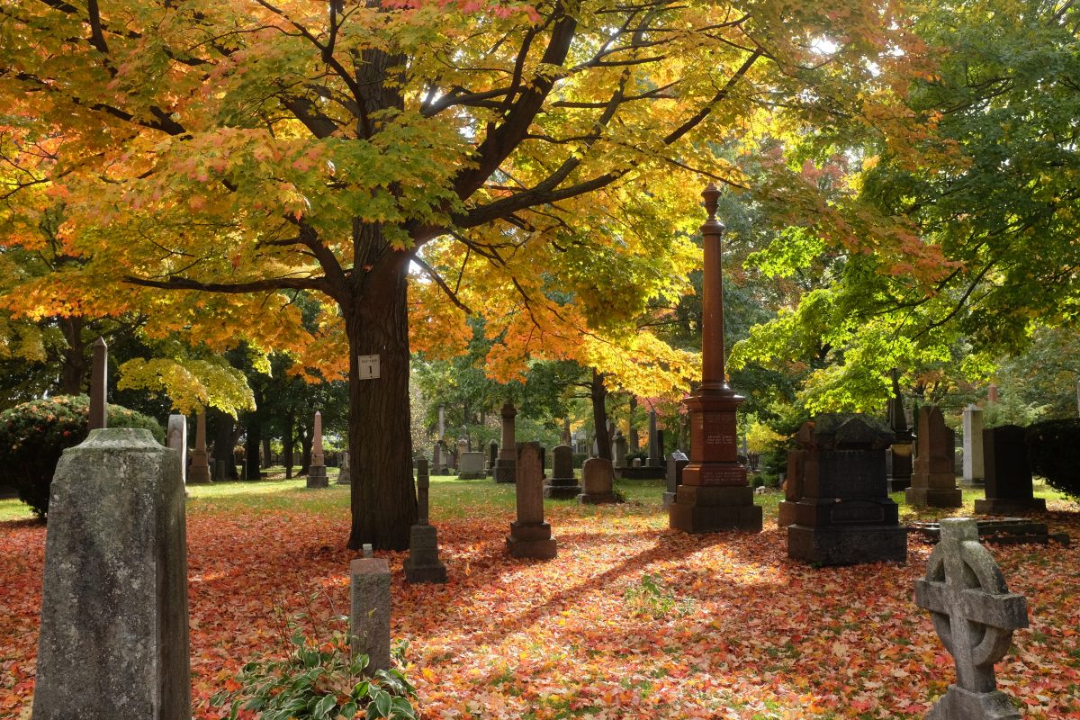
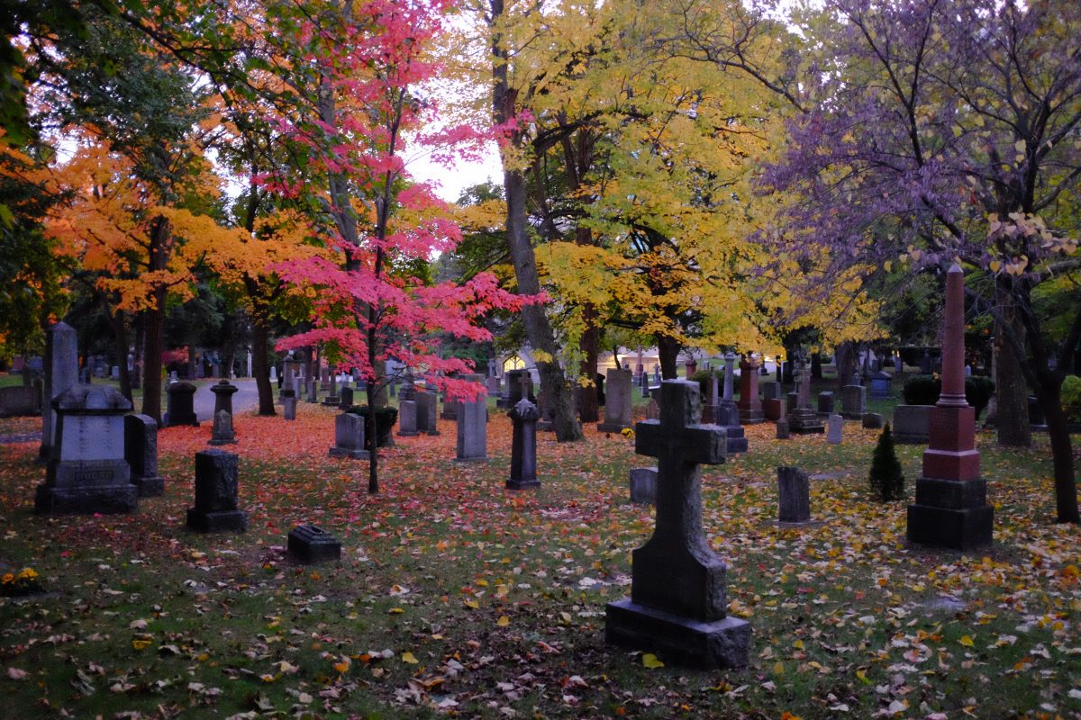
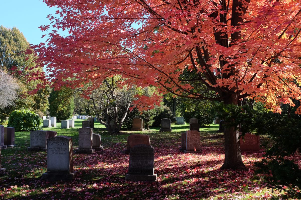
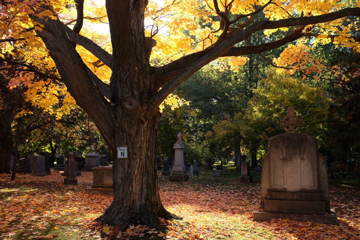
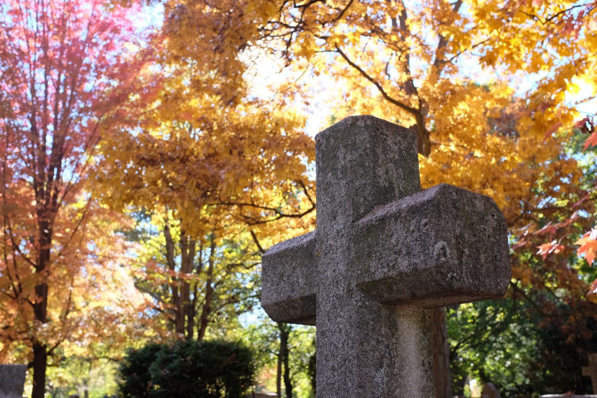
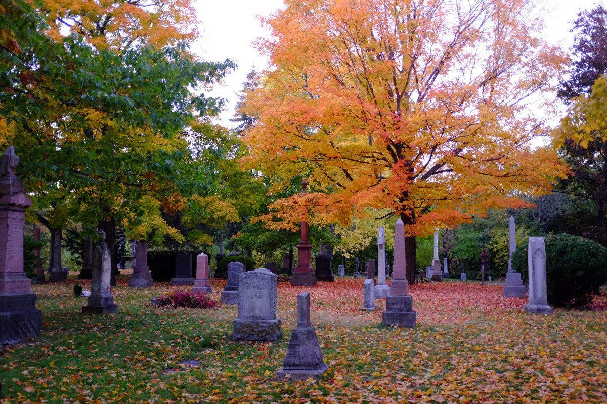
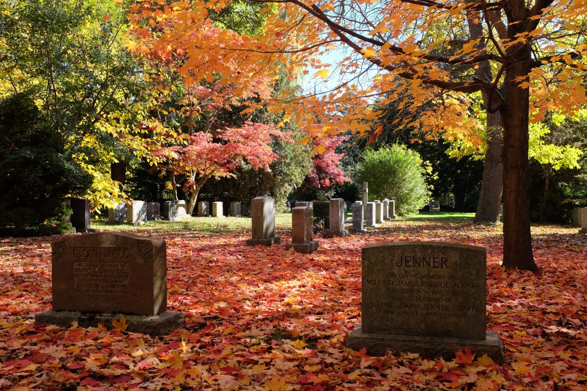
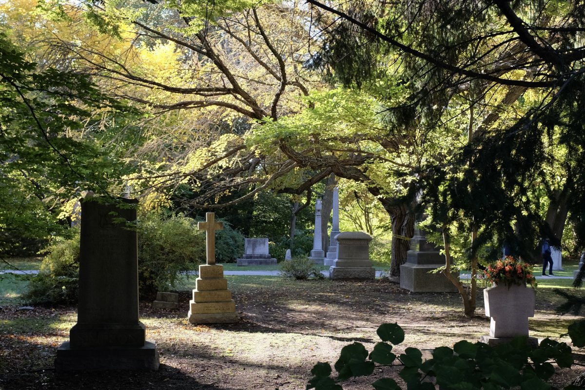
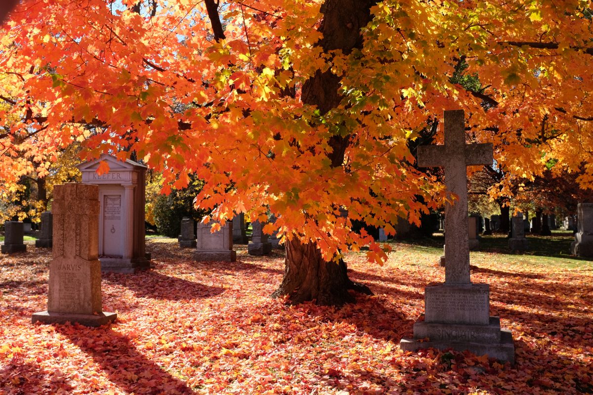
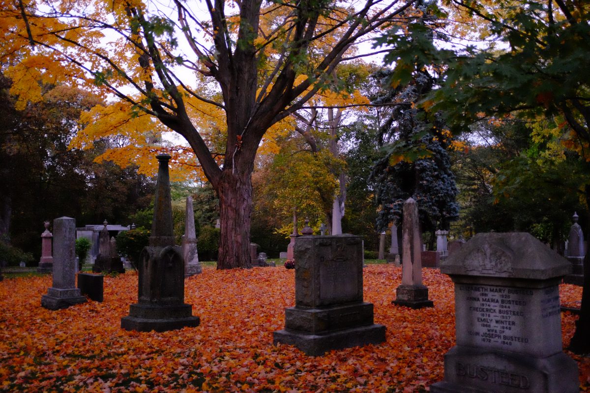
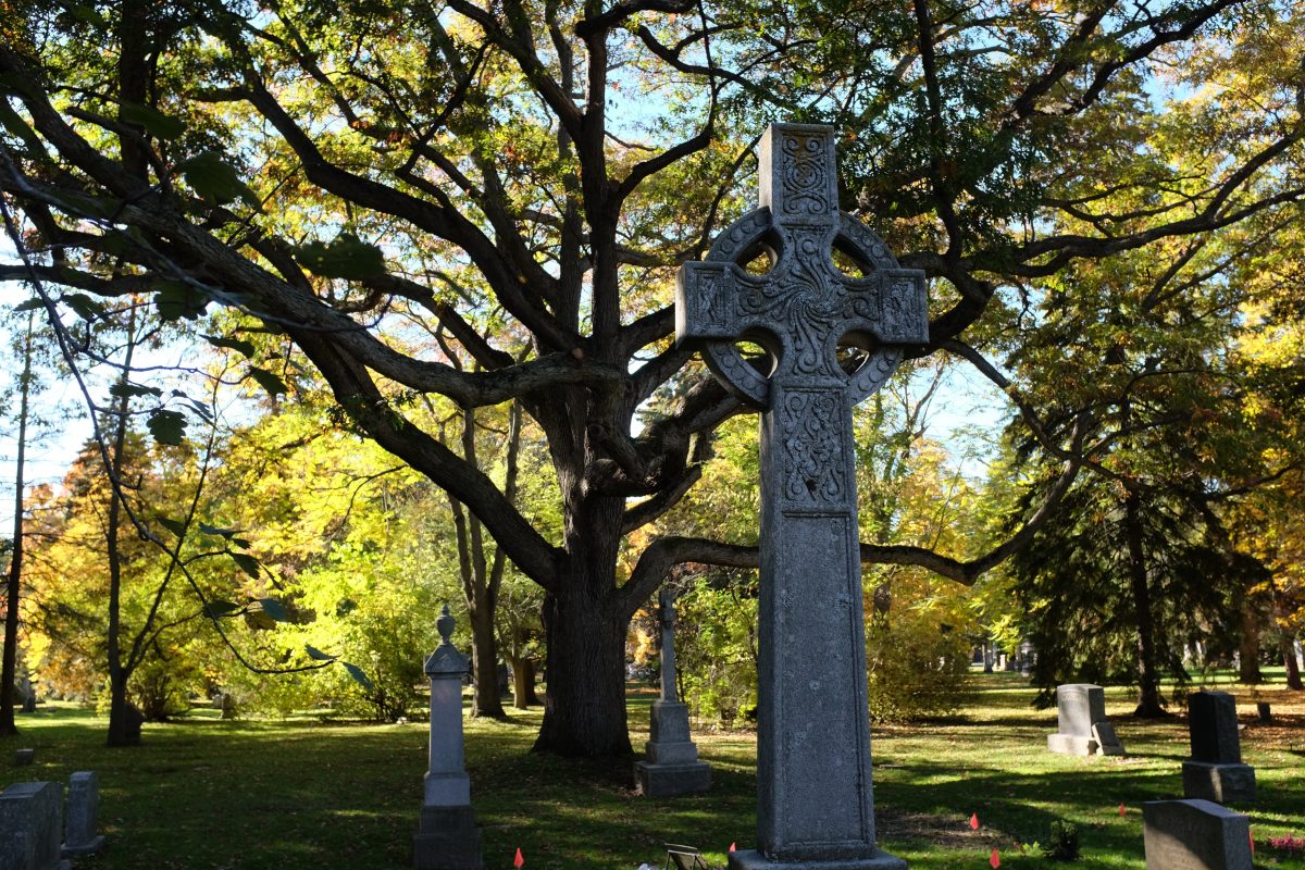
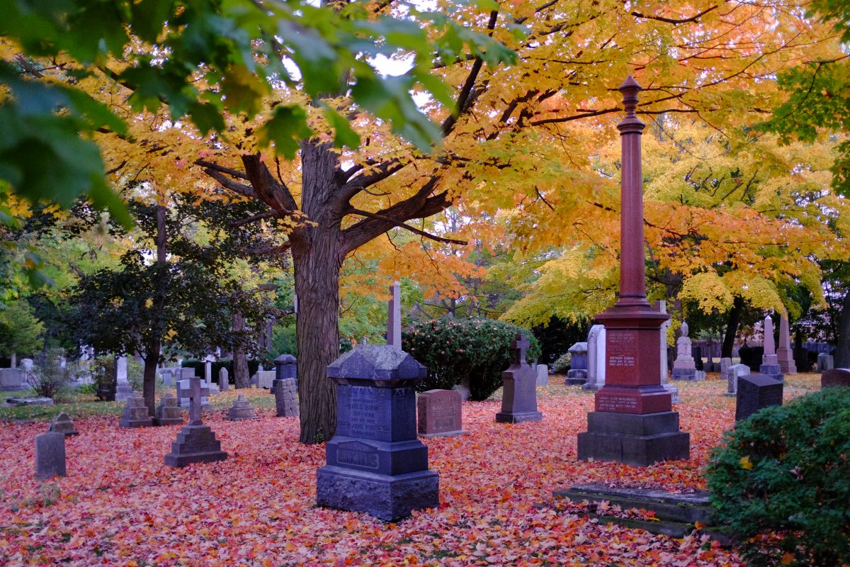
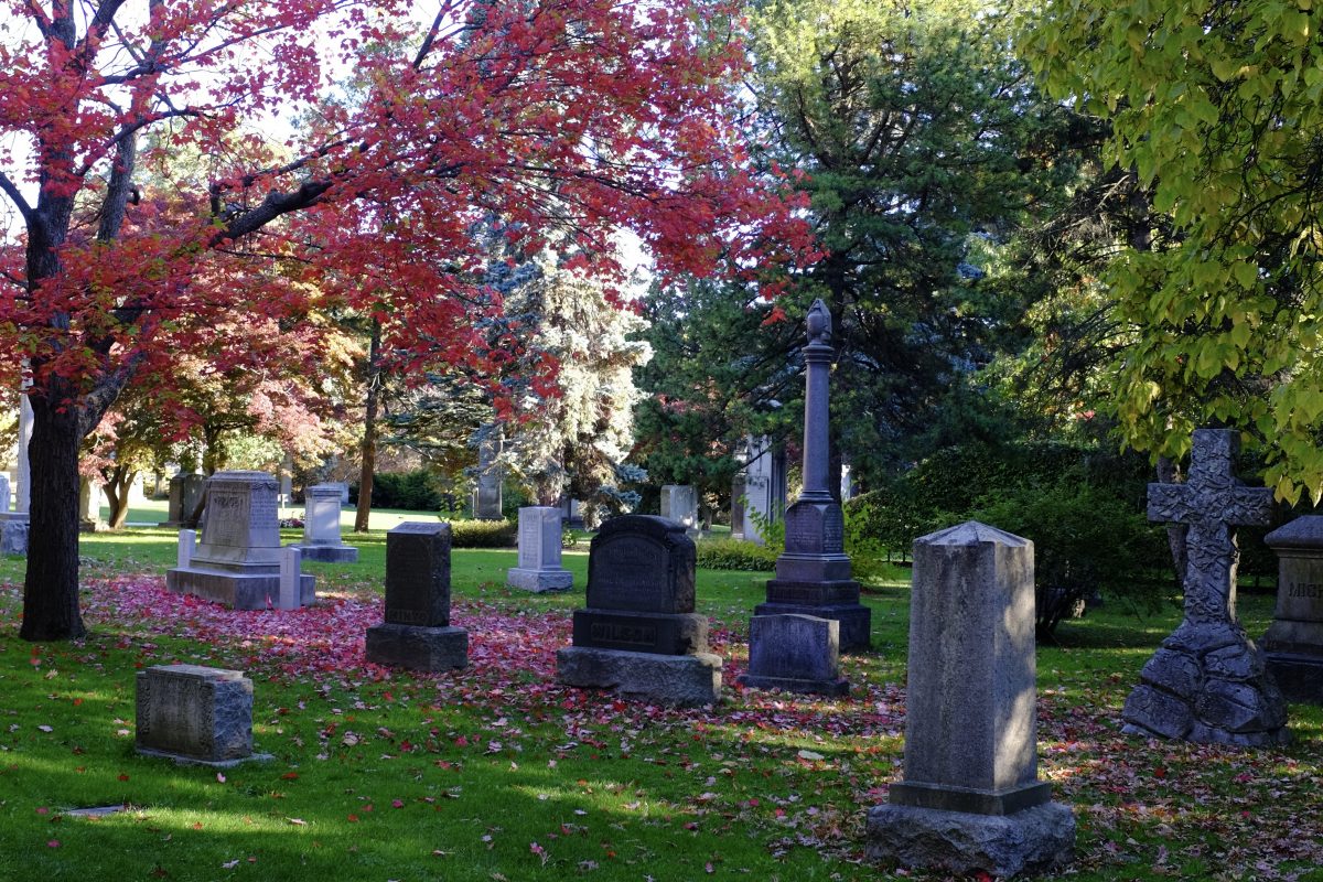
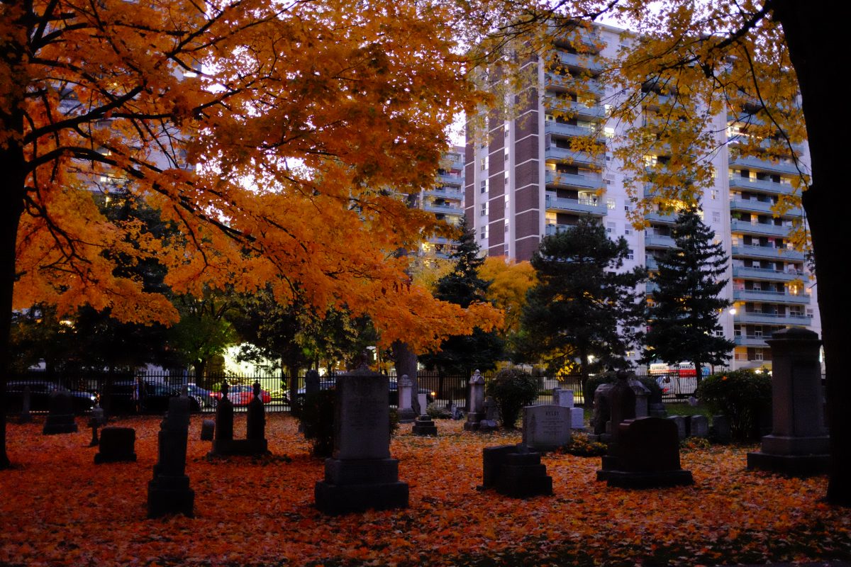
Autumn Cemetery
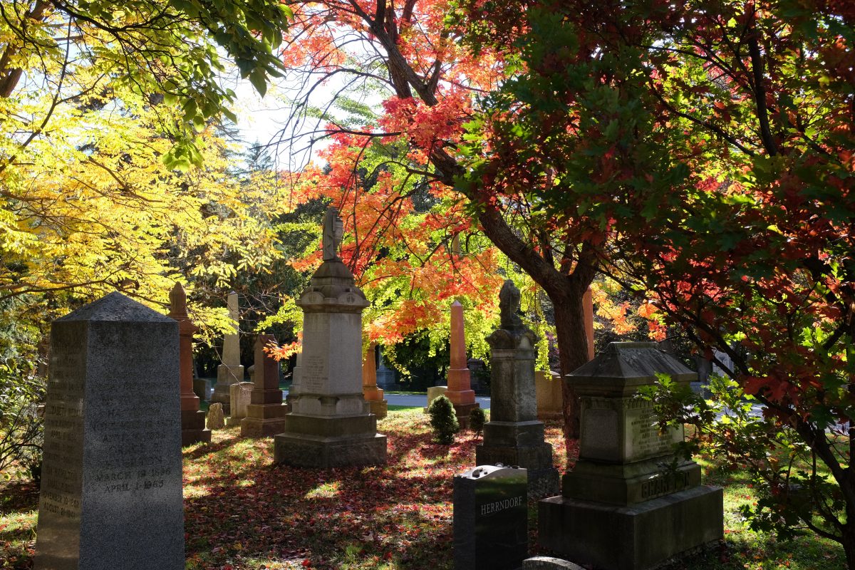
Toronto Cemeteries:
I am lucky to live within walking distance of 3 beautiful old cemeteries: St James Cemetery, The Toronto Necropolis and Mount Pleasant Cemetery. I spend a fair amount of time in these places. Here, gigantic old trees grow to their full natural forms, never chopped and deformed to make way for electrical wires. There is no constant hum and noise of traffic. The are only ever a few people and they usually seem quiet and contemplative. Even their dogs don’t bark. I took these photos over a few autumn days walking through St James and Mount Pleasant cemeteries.
Death (and Beyond?)
As a child, I remember finding dead birds in the grass under big windows and examining their intact but unmoving bodies. I thought: “It looks like a sleeping bird but, something is missing…it’s not asleep and somehow, it’s not really a bird at all anymore.” It wasn’t something I could see…but something I could sense. A cold absence. Going to an open casket funeral some years later, I had the same feeling while peering over the heavily made-up face of the old woman in the box: this is not really a person anymore.
Growing up, I never lost my curiosity about death and I paid attention to cultural and religious differences around the subject. I had so many questions. Where do we go, if anywhere? Do we return in a new form? Do we really face almighty judgement for our behaviour during our short time here? If death separates us, will we meet again? Do we just say these things to comfort ourselves when we lose someone or, do we really believe them? Maybe living is just like a light switch: Now it’s on…you are alive. Now it’s off…darkness…forever. I guess only the dead have all the answers and, at least in my life, they remain silent.
What I know for certain is that the dead can live on in our thoughts, in our memories. They can be present in that way. When I visit a cemetery, I am always mindful of the fact that I am walking among graves and not in a city park. And even though the dead are silent, I feel like I am meeting them in some way. Reading their names out loud and calculating the bracket of time stamped on their headstones I wonder what they might have done while they were still here. Who did you love and what did you care about? How did you manage to grow so old? And why did you die so young?
Remains:
Long ago, reading a Rohinton Mistry novel, I discovered the Zoroastrian practice of laying the dead out on a Tower of Silence for the vultures to eat the flesh from the bones. The idea seemed shocking at first but later, I learned that this custom is a final act of charity: to feed the flesh to the birds rather than letting the body go to waste. The living help the dead to perform a final act of good will. In the West, this might seem like an objectionable practice. But, the Zoroastrians would probably think that incinerating a body in a gas oven and placing the ashes in a jar to display is strange and wasteful. There are so many different ways that the living dispose of the dead. Religious or cultural beliefs usually dictate the method, but more recently, economics of space and cost are influential as well.
These days cremation seems to be most common method while certain religions still insist on whole body burial. “Green” burials (where shrouded bodies are interred to decompose in a natural area) are becoming increasingly popular. Burial at sea for servicemen and civilians still happens. A few small areas of the world still practice mummification. In Tibet, because there is only rock underfoot, the dead are left on a high peak to decompose or be eaten in what is known as a sky burial. Similarly, indigenous tribes in parts of British Columbia and the US southwest used to perform tree burials, where a body wrapped in a shroud gets placed in the high crook of a tree for nature to use.
About Cremation
I have noticed quite a few job openings for crematory workers lately. The pay is high and there are almost no requirements other than being able to lift heavy things (one end of a corpse I assume). Not knowing much about the process of cremation, I did some research.
As expected, bodies are placed in gas ovens and burned at high temperatures over several hours. But not everything turns to ash. Bone fragments remain, and these get put into a “cremulator“, which works much like a coffee grinder. Bone fragments go into a hopper, get ground up and deposited into in a paper bag below. The bag of ash and powdered bone is sealed, labeled and placed in a container to be returned to the family. Artificial joints made of metal remain intact after cremation and, if the family does not request to have these parts returned, the metal is recycled and repurposed.
In Japan, cremation is handled a little differently in that the bone fragments are not ground up. Instead, they are collected and placed into an urn which ends up in a family grave or mausoleum. Family members use ceremonial chopsticks to pick bone fragments out of the ashes starting with the legs and ending with the skull. This way, the person will not be assembled upside-down in the urn. It is interesting to imagine of the remains getting handled directly by the family, something that seems so unthinkable in the west.
Traveling
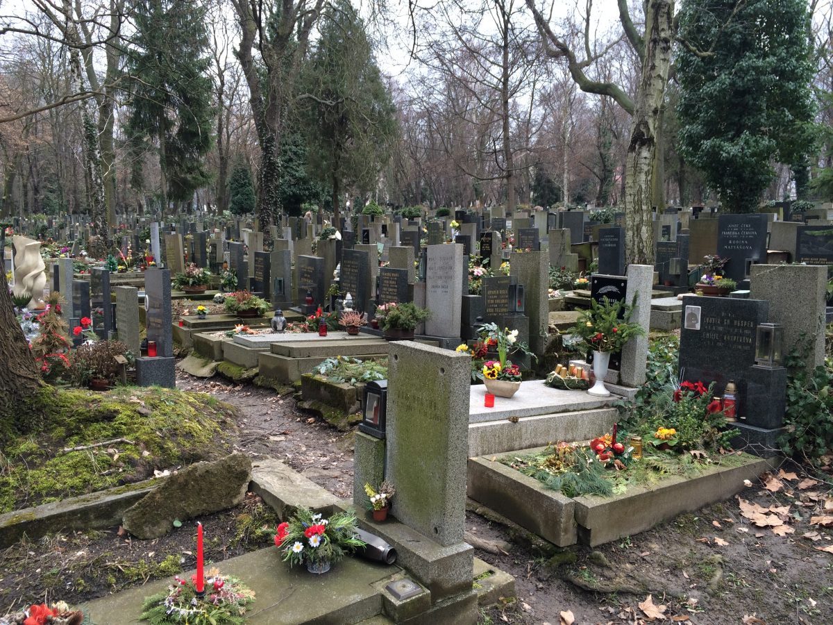
While traveling in different parts of the world, I often wonder if it is ok to photograph cemeteries. I visit them everywhere I go but I never take pictures if there is a ceremony going on or if any family is around visiting the dead. Once, I discovered a beautiful cemetery on a steep hill in Kyoto. There were several families washing graves and leaving offerings so I didn’t take any pictures. But, I was moved by the devotion with which the visitors cared for the graves. It was my first time seeing anything like this.
I have pictures of old cemeteries in Zizkov, Praha, where my mom grew up, ones she would have passed by everyday. They probably look exactly the same now as they did back then. My grandmother is in there somewhere although I haven’t been back since before her death, around the time of Covid. I look forward to visiting her sometime soon.
Gwangju

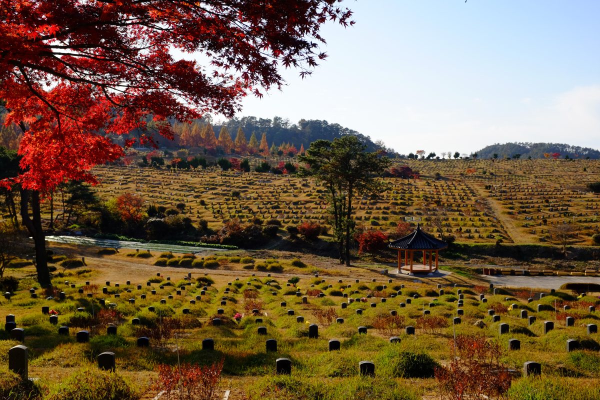
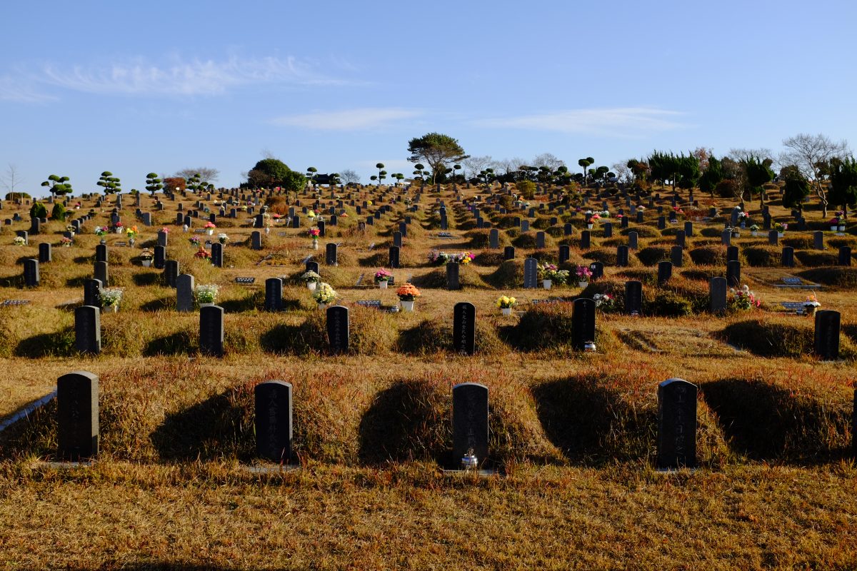
After reading Han Kang’s Human Acts (a deeply affecting book set around the days of the Gwangju Uprising and massacre in 1980), I felt a need to travel to Gwangju on my next trip to Korea in 2017. On a bright and chilly autumn morning, I got on a bus and arrived at the Gwangju Memorial.
Other than a few attendants at the museum, I was the only person there. It was a truly beautiful place, especially on that day, flooded with sunlight and the colours of fall. After a walk through the memorial and the museum, I wandered on the footpaths which eventually opened up onto an old cemetery in the hills. It was breathtaking: the silence, the beauty. There was nobody else there so I took photos, two of which are below. I remember the distinct feeling of not being alone even though I was the only person in this huge open space.
We don’t talk about death much around here….
I think about death pretty often. And the older I get, the more I think about it. Never in a fearful or sad way…maybe more like a calm acknowledgement that it is inevitable. I am much farther from the starting line than I am to the finish line, and people have been disappearing from my life for years. More than half of the family members I knew growing up are now gone. Childhood friends have disappeared. Even people I have known who were much much younger than I am have had their lives cut surprisingly short.
Death is always accompanied by the deep sadness of those left behind. But, I think it is also an important and positive reminder that you….you are still alive. Whenever I am walking through a cemetery, I am reminded that I will be joining the club in the not so distant future but, more importantly, that I am still alive right now. It’s a potent warning that time is short and shouldn’t be taken for granted. Every minute you are alive is another minute you are closer to death. Really. No exceptions.
As to what happens after our heart stops and we draw our last breath…who can say? I do know that when I am in a cemetery, even though I might be the only person walking among the acres of trees and headstones, it is impossible to feel lonely there. I just never do. Are the dead keeping me company? Are they watching from somewhere?
We don’t talk about death so much in the West so I hope this doesn’t come across as something too uncomfortable or sad. I would be happy if it was just the opposite. Every morning, I wake up feeling genuinely excited to start another day. I can’t wait to see what happens next. I open my eyes and I think: “Ah…I am still here. Thank you!” Every day.
If you have any comments or suggestions, please leave them below. I look forward to hearing from you. Thank you for reading TigerSalad! If you enjoy the content and would like to contribute towards website maintenance and development, you can make a donation here.
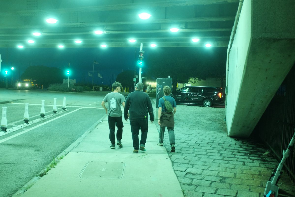
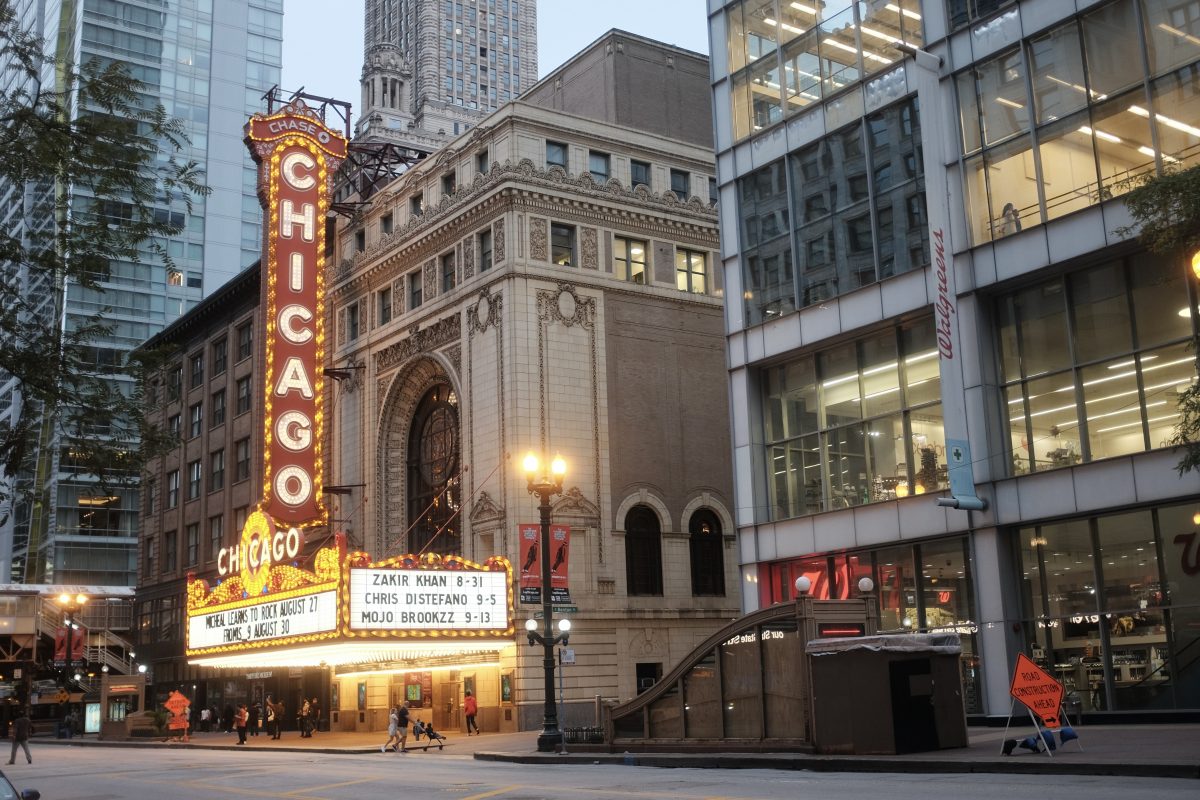
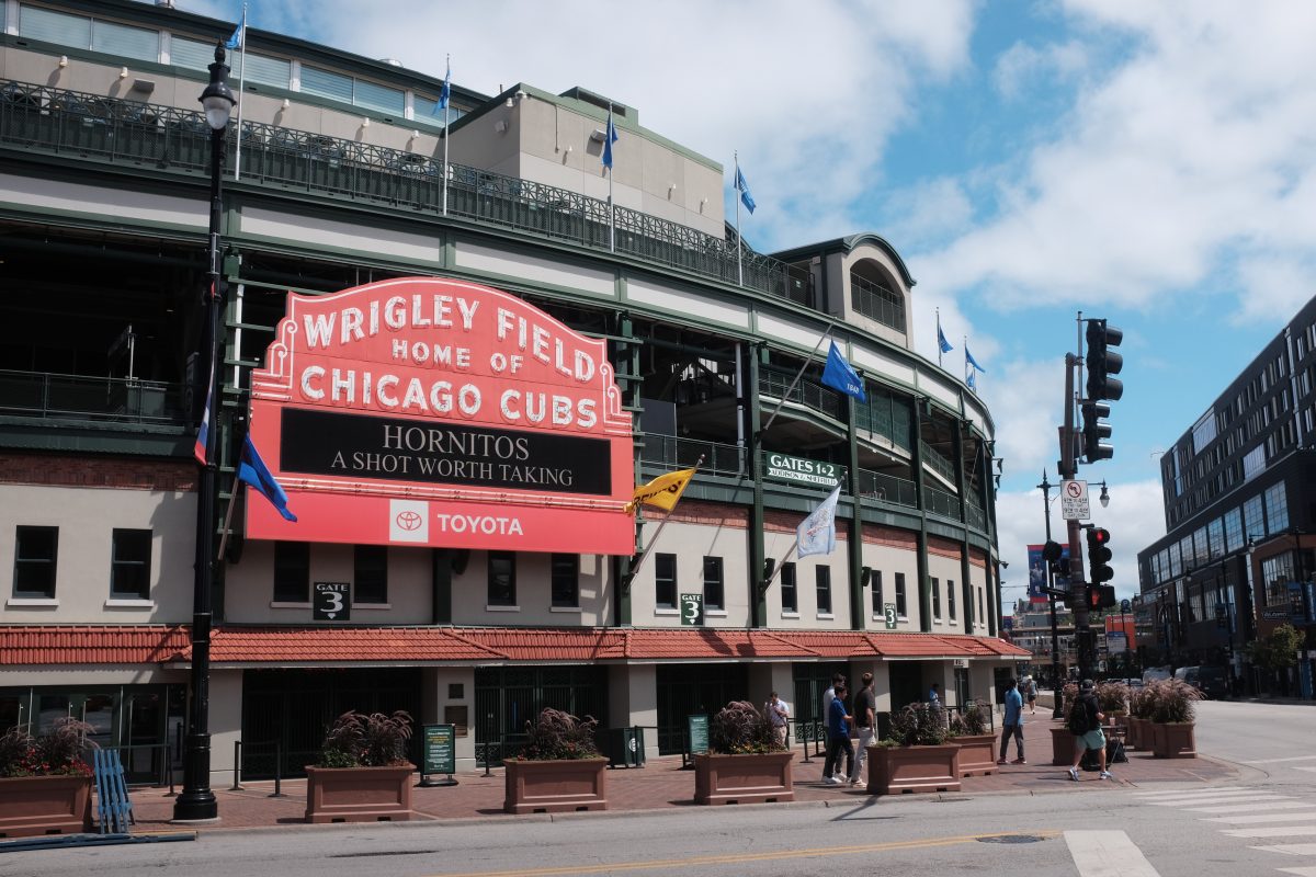
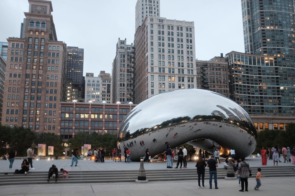
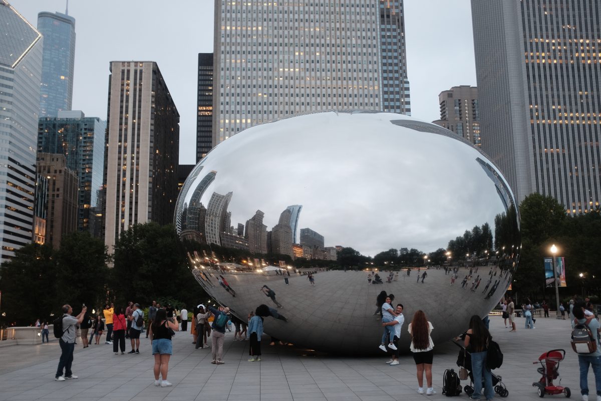
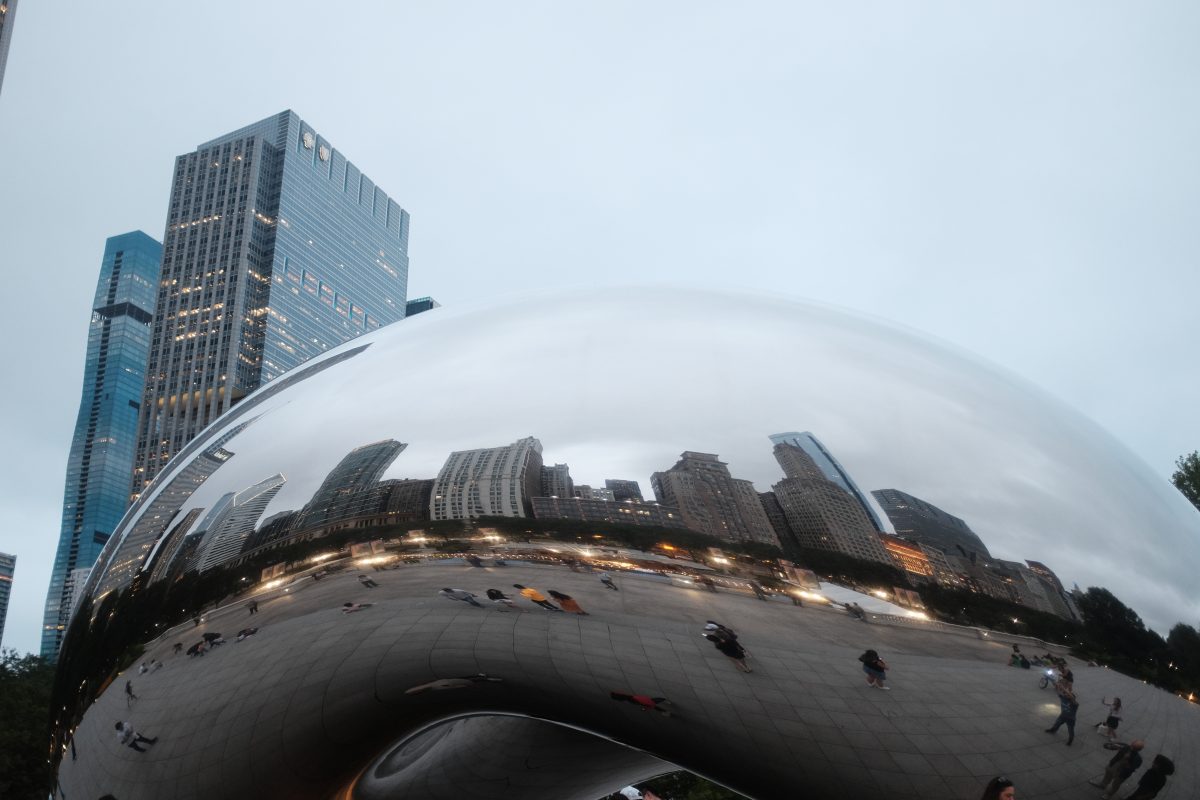
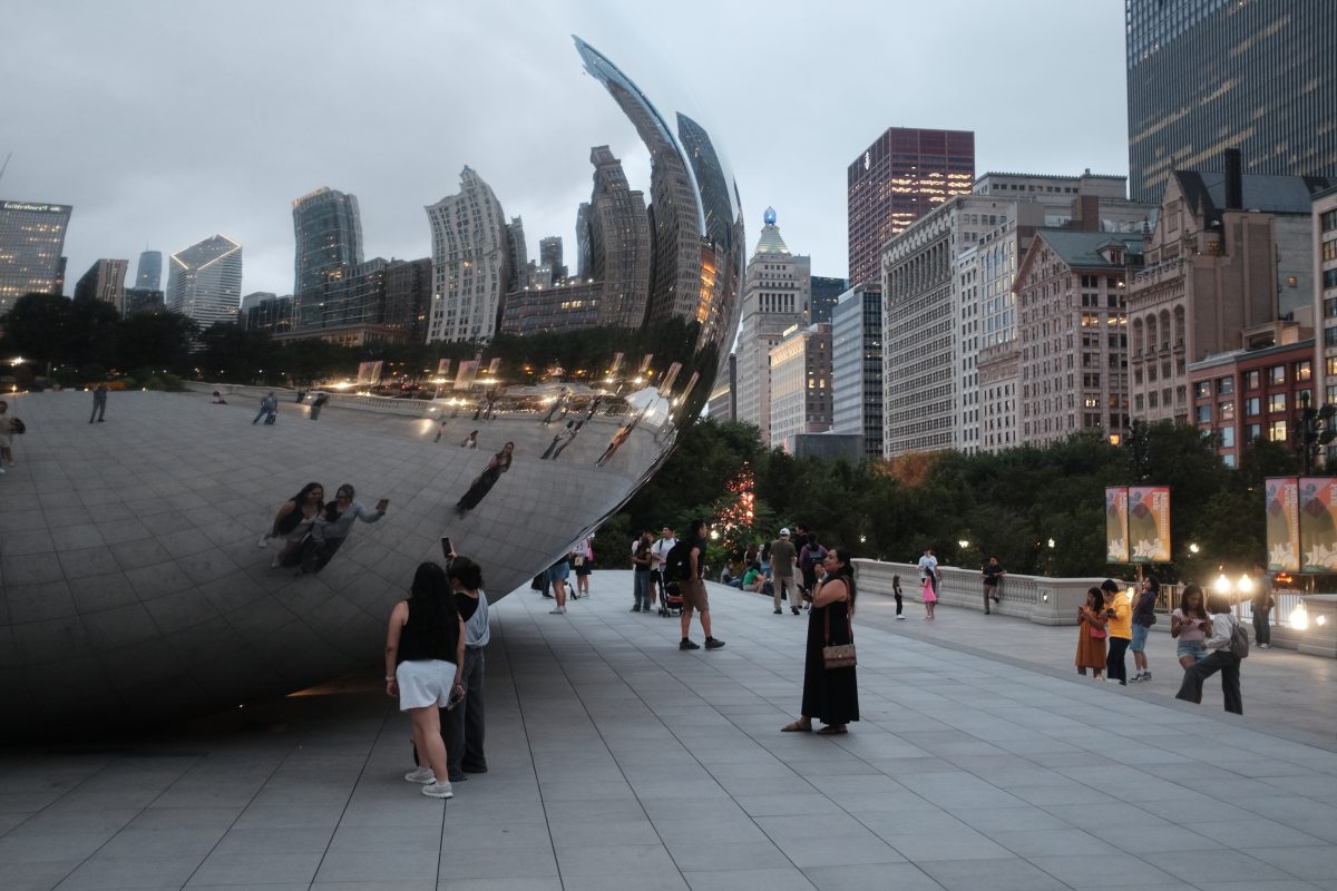
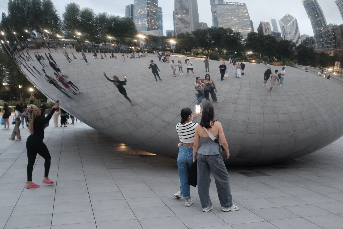
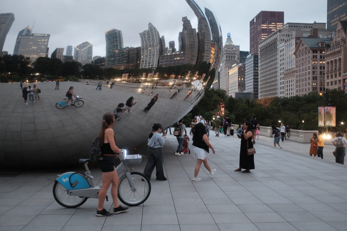
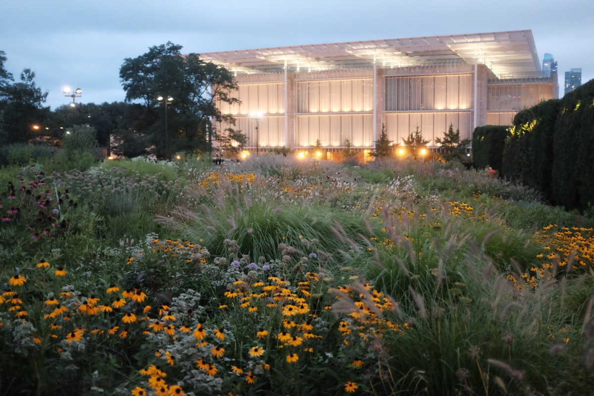
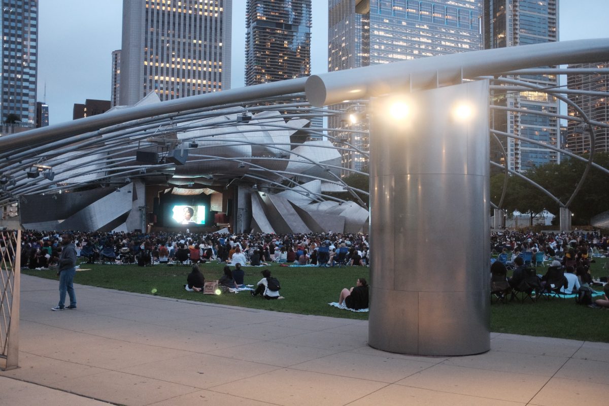
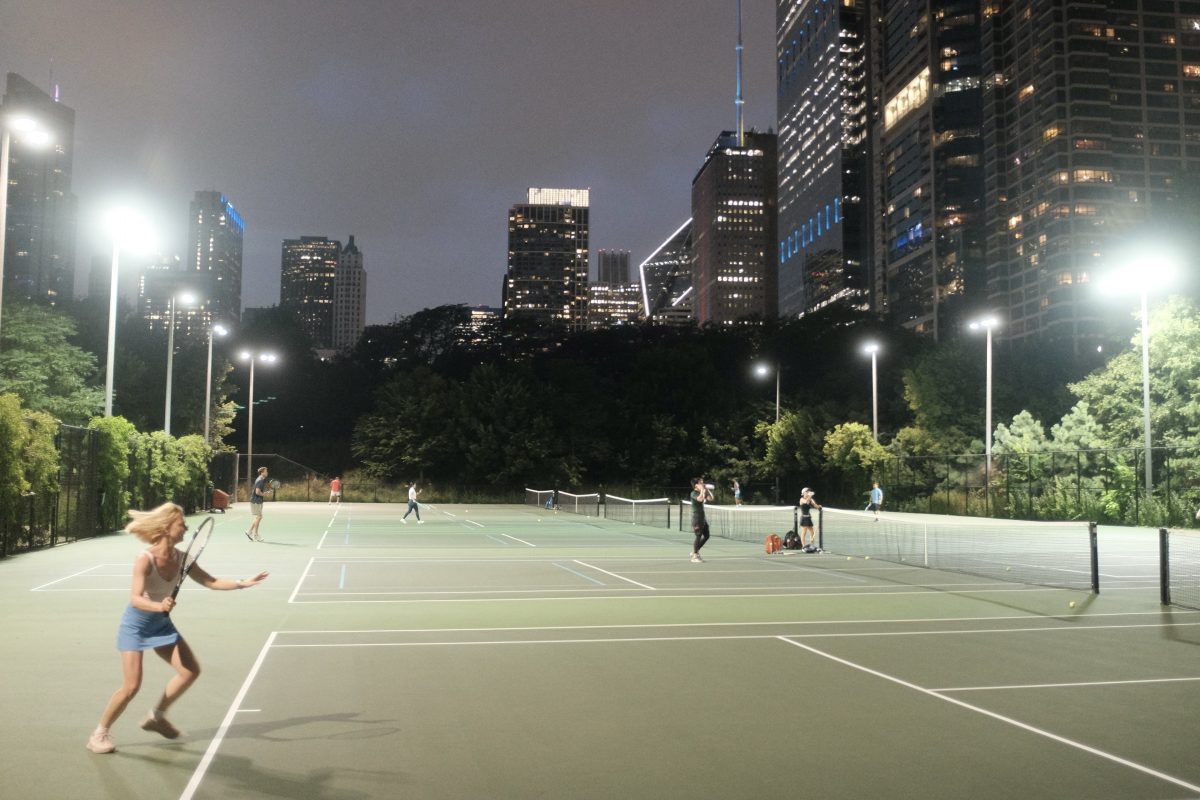
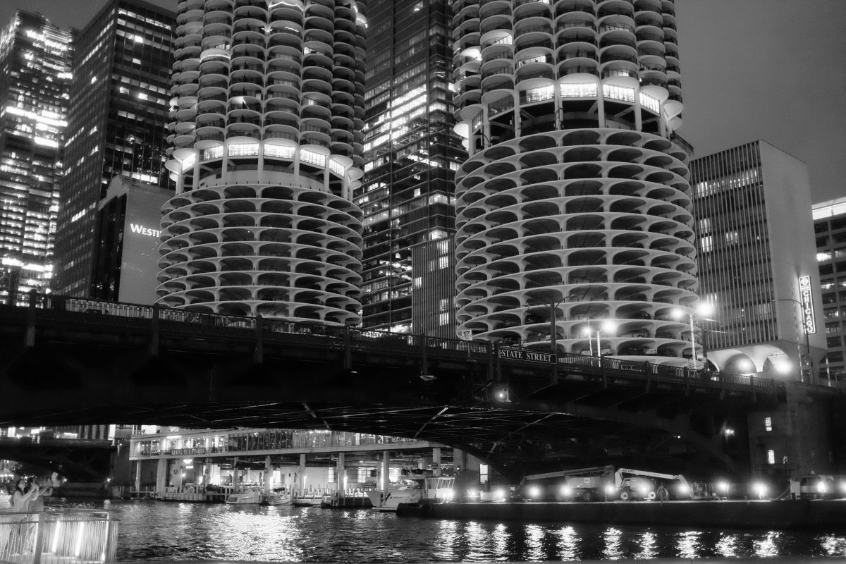
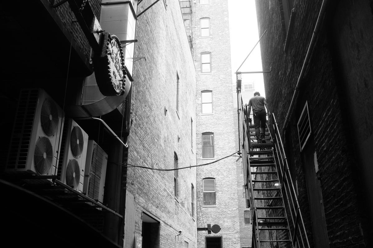
Chicago 48hrs
Chicago
Chicago seems like a city that is doing a lot of things right. The more time I spend here, the more I like it. There are endless low rise/high density neighbourhoods with sprawling canopies of old trees giving shade from the summer sun. A healthy independent retail scene fills countless blocks with small stores catering to every niche in fashion, decor, music, etc. Restaurants seem to be thriving as well. In 48hrs, we had great meals at places from classic sandwich shop Mr Beef up to Michelin star restaurant Sepia. Special mention to Jersey Mike’s for one of the best fast-food submarine sandwiches I have ever eaten. The CTA L-trains, stations and entrances are clean and efficient with colourful tiles and architecture that fits in perfectly with their surroundings. The lake is bordered by easily accessible parks, public spaces and beaches, theatres, sculpture and botanical gardens. There is so much more. It is the first place that comes to mind when I think of great American cities.
About the photographs
This was a short and busy road trip so I didn’t take as many photos as I would have on a slower adventure. But the tradeoff was that I got to see and do many fun things in short time with great company. As a die-hard solo traveler, I am starting to warm up to the idea of traveling with others (depends on the people though!). This time around, following the lead of my friend’s two sons as they scoped out cool spots in the city was an absolute pleasure. Hope we can do it again someday.
Just before this trip, I installed a mild diffusion filter on my camera lens (Tiffen Glimmerglass 1). It has tiny specks of reflective material sandwiched between two glass plates that serve to scatter and diffuse light. Mounted on the front of my Fujifilm X100 lens, in daytime photos it tends to smooth out transitions between between bright and dark areas. Points of light (especially at night) show some halation (they glow softly like halos). It is a mild effect but I think I like it…
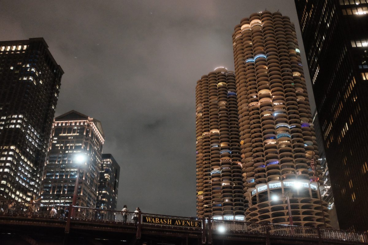
A couple of Chicago landmarks
Millenium Park
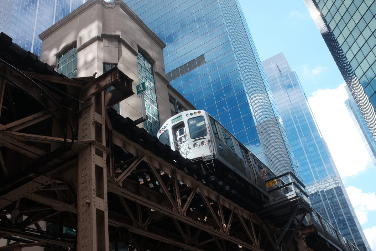
Chicago Transit Authority (CTA)
This time around, we only used the L-train although I have used buses in the past. The CTA seems like a clean and functional system. The L-train stations have beautiful tile-work but I didn’t have enough time for pictures. Next time I come back, I will focus a little more on the L-train and stations including sound recordings.
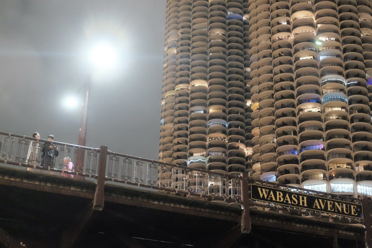
Chicago Architecture
I think I could spend a week just looking at buildings in this city. Below are a few of the better known ones. But, at least for me, all the beautifully built and maintained low rise apartment buildings are just as impressive. The number and variety of perfectly preserved low-rises in residential neighbourhoods is astonishing. This city is a real knock-out.
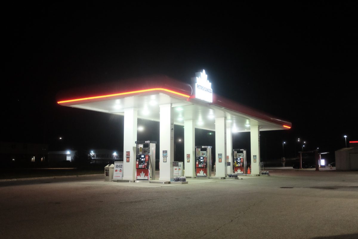
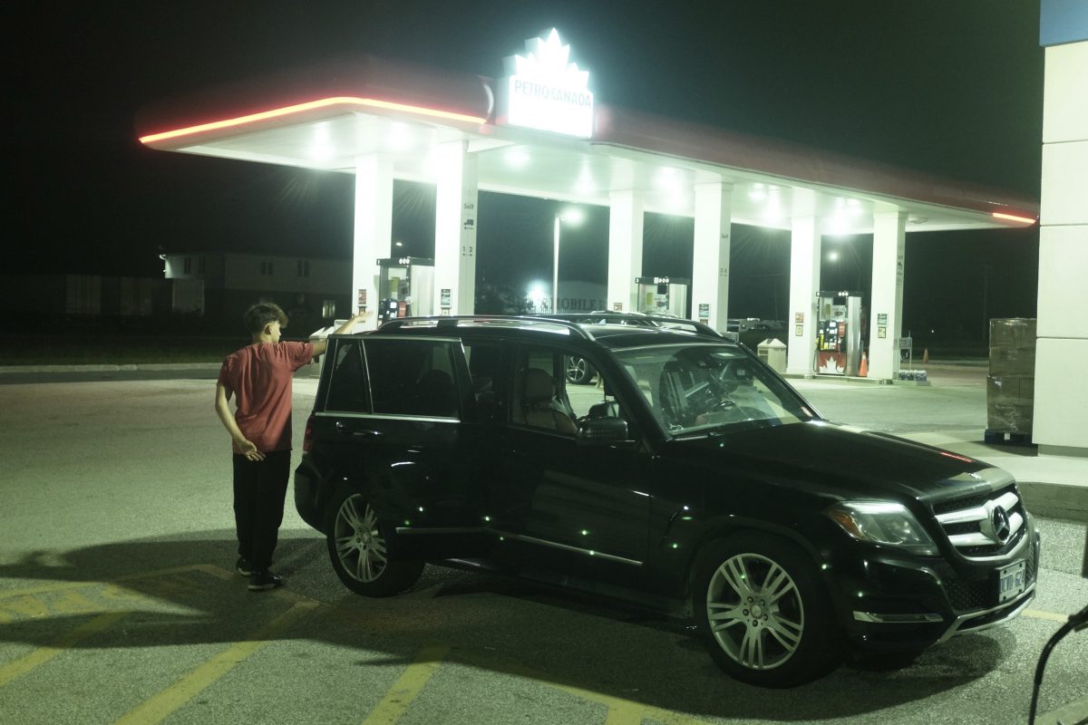
The way home
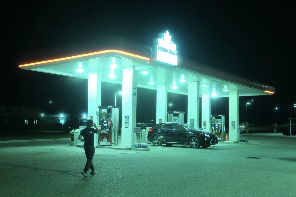
I was amazed at how beautiful US gas stations and rest stops are. Not enough time this trip to really document them but I did get in a couple of shots on a midnight break on the way home, just back over the Canadian border. Next trip I will focus on these colourful oases in the pitch black countryside.
This was a short but fun mini-vacation. Hope we can do it again soon with more pictures and sounds. As always, if you have any comments or questions or if you don’t like the plural of oasis, please leave your thoughts below.
If you enjoy the content and would like to contribute towards website maintenance and development, you can make a donation here.
Diagram
***this post will not work in tiny form on your phone. Have a look on a bigger screen if you can***
What’s a diagram?
In broad terms, a diagram is a visual representation of an idea or a system of related parts. It might explain how the parts function together or, it might just depict how the parts relate to each other in physical space. A diagram is usually a drawing or a flow of symbols representing and simplifying the workings of something.
Can a photograph be a diagram?
I think so. A photo can be labeled with words or over-laid with symbols that clarify what you are looking at or, how the different things in the photo relate to each other. I can remember school textbooks full of diagrams, from drawings showing the organs of a plant cell to photos labeling the parts of an airplane wing. I would pour over them for hours and I still love looking at them today.
It seems like a lot of old technical instructions came with roughly labeled black and white photos too. I had a motorcycle repair manual that was full of terrible black and white photos with what looked like taped-on labels. Things like lawn mowers, power tools, instruction manuals from small factories…these often used to come with labeled photos.
When I was a boy, some of these diagrams inspired me to take apart appliances when my parents weren’t home and draw pictures as I went so that I could put them back together again. These were my own diagrams and they worked! Usually…
IKEA
IKEA is notorious for it’s cryptic diagrams aimed at having a single instruction manual that works across all languages and cultures. This is a pretty ambitious goal and I don’t think it always works. The IKEA diagrams have become kind of a universal joke with anyone who has had to sweat over assembling a flat-packed bookcase or file cabinet. Over the years, I have gotten a little better at understanding them but….I also think I could improve them quite a bit. That would be a fun job : )
The Calypso
The Calypso was Jacques Cousteau’s ship. When I was small, all I could think about was the ocean. I read everything I could in the school library and then begged my parents for my own Jacques Cousteau Encyclopedia. Eventually they got me the books. My absolute favourite book was the last volume. In it was a 4 page foldout of all the rooms and systems on the ship. Both sides! The rest of the books are long gone now but the Calypso book is still on my bookshelf. This is a classic diagram with numbered lines that correspond to a key on the opposite page. It is one of my favourite diagrams of all time.
Here is one side of the Calypso diagram:

How we arrange all of our “things”
Something I like to do on Instagram: when someone posts a selfie or other photo taken inside their house, I like to zoom in on the backgrounds and have a look at what is on the walls, what is on a bookshelf or a table. I like to see how people arrange their “stuff”. The background is sometimes more interesting than the main subject.
With that thought in mind, I had a look at some of my old photos and also around my apartment to see how my things were arranged and how they might relate to each other. Sometimes arrangements seem random but other times there are patterns…the stuff we use more often is easier to access. Or things that get used together are grouped together. Sometimes there is a logical flow to the physical arrangement of our things. And sometimes, there is a kind of beauty to the random placement of things, how they just happen to end up in space. I often think how difficult it must be for art directors on a set to get all these kinds of details just right to make a fictional environment feel believable.
My photo-diagrams
Below are some diagrams that I made of stuff around my house or things in past pictures. I like the look of these kinds of labeled photos. They remind me of old parts manuals or science fair projects when paper and glue was the only way…

photo copyright TigerSalad 2025

photo copyright TigerSalad 2025

photo copyright TigerSalad 2025

photo copyright TigerSalad 2025

photo copyright TigerSalad 2025
Diagrams as art
I think there is something meaningful and personal about the way we arrange our “stuff”, our tools and our less functional objects. And I also think there is both art and science in good diagrams. I tried to combine both ideas here into something fun and engaging. What do you think? If you have any comments or questions, please feel free to leave them below. And subscribe if you would like a note about new posts. Thanks for reading!
If you enjoy the content and would like to contribute towards website maintenance and development, you can make a donation here.
Queen Street East
***your phone will magically turn good pictures into bad. Try looking at this post on a bigger screen if you can***
To Book City in the Beaches
This morning, I finished up the last chapter of a fat book that I have been reading for a few weeks. I had a new title in mind so I decided to take a walk from my place to the Book City in the Beaches neighbourhood. Book City is one of the last independent bookstores so, in an effort to support small business, I try to buy most of my books there. And, lucky for me, they had a single copy of the book I wanted. This long walk would take me along most of Queen Street East through Corktown, Leslieville and to the Beaches (named for the white sand beaches nearby along the shore of Lake Ontario).
Return flight
Since I had my camera with me and since I don’t get to the Beaches very often, I decided to take a few photos on the 7km walk home. Compared to the rest of Queen Street, this area has some truly old and interesting low rise architecture and businesses. Some blocks of Queen Street East are so quaint, they almost have the old-time feel of a cottage-town main street. The commercial areas are mostly undeveloped (so far). There is even a gas station right out of the 1950’s with pumps that look like refrigerators, full service attendants in uniform and a round glass reception area. I am excited to take some pictures of it at night! Coming soon!
The Photos
I had not planned on posting about this so I was just taking random pictures for fun. The photos are not really meant to be representative of anything. I just liked enough of them that I wanted to share them. They are generally in chronological order from the Beaches travelling west back towards Corktown.


The End
Hope you enjoyed some of these photos. Queen Street at the Beaches is lined with fun and unique shops and restaurants and is definitely worth a visit. I will be back soon for some night photos. As always, if you have anything to say, even if it’s just “Hi” feel free to comment below.
If you enjoy the content and would like to contribute towards website maintenance and development, you can make a donation here.


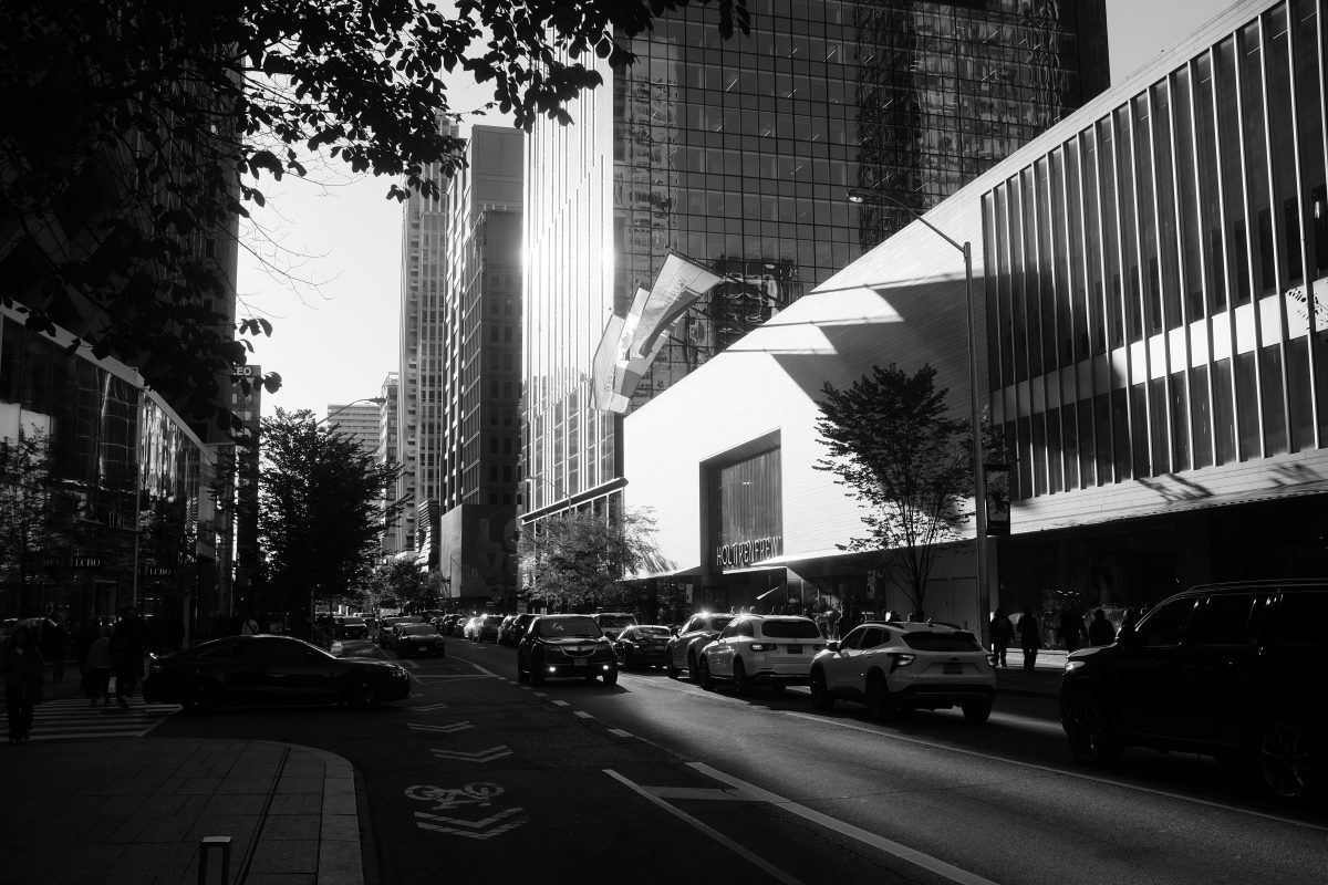
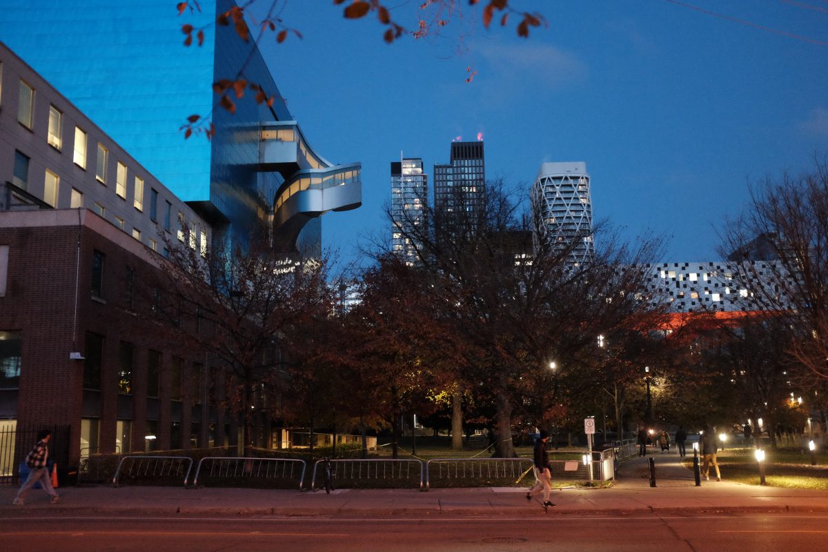
St James Town at Night
***your phone will crush and distort these pictures. If you can, try to see this on a bigger screen like a laptop***
A Very Short History of St James Town
St James Town was once a working-class Victorian neighbourhood, housing the poorest of Toronto residents in ratty decaying homes. In the 50s and 60s, city planners and developers decided to rezone and bulldoze most of the neighbourhood. Over the next decade or so, they built nineteen highrise buildings including 4 city owned public housing towers. At the time, developers assumed that fresh young middle-class office workers would quickly move in. Instead, that demographic chose to move to the suburbs of North York and Scarborough and the neighbourhood filled up again with Toronto’s lowest income families. Over the last couple of decades, the demographics have shifted more towards new immigrants to Canada and St James Town remains one of the last affordable neighbourhoods in the downtown area.
For a more detailed account of St James Town history and development have a look at this excellent article at Blog TO.
Bad Reputation?
In the late 90’s, when I first moved to Toronto, St James Town had been in steady decline for 30 years. The buildings were crumbling, the public spaces were trampled and neglected and the residents were some of the poorest in the downtown area.
One day, shortly after moving to this city, I went to visit a friend downtown and missed my subway stop. As a result, I accidentally came above ground at the tiny run-down Glen Road exit of the Sherbourne subway station. Glen Road consists of a single block of some of the last surviving Victorian homes in the area but, at the time, the houses were all boarded up and abandoned. It was like coming up into a ghost town of haunted houses. I was so surprised that I took a bunch of film photos but, unfortunately, I can’t seem to find them now. If you want to see some images from this time, this site has some good ones.
A little later I met my friend and told him about getting lost in St James Town. His advice was to stay away from the neighbourhood, even during the daytime. Apparently the area had a bad reputation for drugs, gangs, violence, prostitution. I had no idea if this was true or not but I took his advice and never came back. Not until over 20 years later when I ended up renting an apartment on this very street.
St James Town Today
With 19 highrise towers in a relatively small area, St James Town is the most densely populated neighbourhood in Canada . The “official” population of St James Town today is around 17 000 although it is probably much higher. It is still home to many low income families and is a popular landing place for new immigrants.
Sometime around 2000, the city decided to put some resources towards improving the crumbling neighbourhood. This included plans to clean up and repair the old highrises and renew the parks, playgrounds and public spaces. This is ongoing today.
Eventually, developers started to sniff around one of the last downtown neighbourhoods that had so far escaped gentrification. Condo speculators bought up and fenced off many of the old neglected houses and plots of land. They also gutted and renovated the row of abandoned houses on Glen Road in return for the city’s approval of their development plans. They squeezed in a few new glass and steel towers and tucked little townhouses into the shadows of the old highrises. Since I moved in, no less than 5 new condo buildings have gone up within a 1 minute walk. And many more are on the way.
Living in St James Town
I think that St James Town still has something of a bad reputation today. Reading online, I often see postings where people are nervously asking about safety and crime rates before moving in to the area. And still others (who probably don’t even live here) advise them to be very careful, especially at night.
I have lived here for years and have not had a single incident that would make me feel unsafe. Police, ambulances and fire trucks are a pretty regular sight. But, when you have over 17 000 people living on a few city blocks, this doesn’t seem unusual.
I like that this neighbourhood always has people moving around in it. You are rarely by yourself outside. To me, this feels safe. I used to work at a restaurant directly south of St James Town in Old Toronto. The walk home from there at night felt so unsafe to me during the covid closures that I would carry a police baton with me at all times. Walking on high alert, I wouldn’t feel relaxed until I found myself among the busy highrises of St James Town again.
Maybe the Best Neighbourhood Downtown…
I love living in this neighbourhood . Everything is in walking distance: dentist, doctor, supermarket, subway, Koreatown, Chinatown, Little India, beautiful natural spaces, museums, universities, galleries, live music venues, great restaurants, a fully operating farm, some of the country’s best hospitals…the list goes on. I think this must be one of the most connected neighbourhoods in the city. I haven’t had a car in many years and I never miss it.
The interior of St James Town itself reminds me of the highrise neighbourhood I grew up in when my parents first immigrated to Canada. People are always outside. The parks and public spaces are full even at night. Extended families get together and pass time in the shade of old trees. People who have immigrated from the same place and share language and culture find each other here, in the building hallways and the outdoor playgrounds. They naturally build communities around their shared experiences. If you walk around St James Town, English might be one of the last languages you hear. Tagalog, Hindi, Cantonese, Mandarin, Korean, Tamil, Russian, Bengali….these are much more common.
St James Town is one of the last places where low income Canadians as well as newly landed immigrants can afford to live connected to the downtown core. And because so many of the residents share a common experience, St James Town has a the feeling of a vibrant community. People know their neighbours and I believe that people look out for each other. The neighbourhood has a strong feeling of family. All kinds of family.
Night Walks Through St James Town
Some would say that the clump of old highrises is ugly but I see real beauty in them…in their multicoloured brick exteriors, angular balconies, weird glowing stairwells, old mature trees and especially in the people who call this neighbourhood home. Hopefully some of that will come through in these photos but, if not, take a walk through here on a nice summer night and you may be surprised by how much you enjoy it.


Convenience Stores
There is a small commercial strip on Howard street with a couple of Filipino restaurants, a fried chicken place, a small pharmacy, an Ethiopian grocery and a Halal butcher. These convenience stores are part of this strip:


I used to buy cigarettes here. The wife’s mom (the 7 year old’s grandma) worked there at the time and I would visit her everyday on my way to work and buy a pack of smokes. She would cheerfully sell them to me while telling me that they were bad for my health and that I should stop. One day, I quit smoking and so, I didn’t go in for a few weeks. When I finally stopped in to buy an ice cream, she asked where I had been. I told her that I quit smoking and so I didn’t need to stop by so often. I couldn’t believe how happy she was to hear that. It was as if I was her own son!

Winter in St James Town
These are a few pictures of a snowy night walk through St James Town last winter. It really is a pretty place.


The Future of St James Town
There is a tremendous amount of demolition and building going on around here. I think the original towers are safe in their big bulky numbers. Hopefully they will continue to see improvements and provide a home for people who can’t afford to move anywhere else.
As for the surviving victorian houses…I am not so sure. Just last year I found out that Concert Realty bought up the whole west side of Glen Road. This is the same developer that is building the 54 story building outside my bedroom window. This means that right now they own a continuous parcel of land that is more than enough to build a second condo tower. They have not submitted plans to the city yet but I think it is only a matter of time. Lately there has been some pull back on new condos so hopefully Glen Road will survive for a few more years…let’s see what happens.
There is so much more…
These pictures just show a little of this neighbourhood. In recent years, the city has put up a brand new community centre complete with sunlit indoor pool, library, indoor basketball courts and community services.
The Rose Avenue Public School right at the centre of St James Town is one of the last original buildings in the area. This brick building with massive old windows was built in 1924 and still operates as a busy public school and day care, surrounded by old trees and brick walkways.

St James Town represents a massive and miscalculated experiment in early city redevelopment. Originally seen as a failure and struggling for decades, I think it has grown into a unique and vital part of the Toronto downtown.
If you have any questions or comments, please leave them below. I am always happy to hear from you.
Thanks for reading! : )
If you enjoy the content and would like to contribute towards website maintenance and development, you can make a donation here.
Losing Focus: Finding Interest in Blurry Photos
***If you are looking at this on your phone you probably won’t see the blur in these photos. Your phone will crush the images to the point where they will probably look in focus. Of all the posts so far, this one needs to be seen on a bigger screen to make sense…
***photographers: this article is not about using diffusion filters to soften focus.
Finding something interesting in “mistakes”
Over the years, I have taken thousands of pictures. Sometimes they turn out great. Often times they don’t. Sometimes the image I was seeing in my mind didn’t translate well with the camera or, other times, the photos are technically flawed. My camera is older and the auto-focus system is not perfect. It struggles with difficult light and reflections, especially at night. So, I tend to get a few photos that are out of focus from time to time. These blurry pictures are impossible to fix and I always delete them first, without any thought, to save space on my computer.
Lately, I have found a few of these pictures that escaped getting deleted. While they are not what I intended, some of them are still kind of interesting. Unfortunately, only a few of these “mistakes” have survived. So, I decided to go out and try to take some out of focus pictures on purpose and see if I could come up with some good shots.
This project turned out to be much more difficult than I thought. My idea was to just go out, find an interesting scene, manually de-focus the camera and shoot away. I shot hundreds of photos and the majority looked terrible…not interesting…just BAD pictures.
But, over a couple of weeks, I managed to figure out which images are more likely to make a good blurred photo. Here are the ones that I think turned out pretty well.
Shooting through moving water


Manually de-focussed still life shots around my apartment
These photos have a dreamy quality about them: you know what they are but all the details are missing. Like…you know there was a person in your dream…you know what you said, you know what you did…but you can’t see their face no matter how hard you try to remember….these pictures have that kind of feeling for me.


Out in the city at night
I thought night shooting might be a little easier but it was just as difficult to get an interesting shot. Here are a few that I did like. In the city at night, there is a lot of hard contrast in the lighting which I found helps to give some structure to de-focussed pictures.


Time Travel

Photos that look like paintings
Scenes with strong texture and clear structure can make good unfocussed images. Because of the large grain and the soft transition between colours, these ones look like oil paintings to me.


Ghosts…
Images with people in them turned out to be some of the most interesting ones. They all look like dream scenes to me. They are clearly people but their limbs are distorted and their faces are obscured. This is how I tend to remember characters from dreams. I don’t think I have ever seen a ghost but, if I did, I imagine that this is what they would look like.


What’s next…?
This was a difficult project and I am kind of glad that I can get back to taking “normal” pictures again. I am really happy with these few good shots that I did come up with. I hope you like them too. Working on a project about shadows…
As always, you are welcome to leave questions or comments below. I am always happy to hear from you. Knowing you have been here motivates me to keep at it. Thanks for looking!
If you enjoy the content and would like to contribute towards website maintenance and development, you can make a donation here.
Tiara Girls in Shibuya Scramble
Smartphones and Social Media: Today’s Popular Photography
These days, everyone everywhere has a camera in their pocket. Smartphone cameras have filters, AI and editing tools that give everyone the ability to take a decent photograph. Publishing photos has also become effortless. Anyone can post their images publicly on social media platforms like Instagram, and image posts get feedback through “likes” and “comments”. This is satisfying and motivating. It is a fun way to share your images with a huge audience.
Social media gives people the motivation to take photographs and smartphone technology makes it easy. The result is that millions of personal documentary style photos are being published everyday. Photo based apps have become a worldwide tool for communication and self expression. But while casual social media snaps are by far the most common type of photography, there are still other types of photographs to consider: images that are able to draw and hold your attention, freezing unique and surprising moments in time. There is a kind of magic in them. They are rare and difficult to capture.
Because these types of photos are so elusive, netting them requires some planning and skill but mostly persistence and luck. Of the thousands of pictures I took on a recent trip to Japan and Korea, I managed to capture only one such image.
The 1/250th of a second miracle

1/250th of a second…that’s how much time is captured here. We are in a huge crowd of people swarming through Shibuya Scramble Crossing in Tokyo. I am quickly walking forward taking pictures from waist level without looking through my camera. The girls are walking quickly towards me headed in the opposite direction. For this fraction of a second, we are facing each other. We are less than 2 metres apart and my finger happens to push the camera shutter. We pass each other and the moment is gone. Forever. One fraction of a second before or after and it would not exist. It is pure luck.
The intimate angle, the fact that the image is in focus and exposed so well and the emotion on display coming together in this tiny moment is almost a miracle. To put it into context, I tried the same technique in the same crosswalk for over two hours and took over 400 pictures. Out of 400 shots, maybe 6 or 7 were usable. Of those few, this was the only one that stood out as something truly special. It made the whole process worthwhile and went beyond all my expectations. It is one of my favourite pictures that I have ever taken.
What sets this image apart?
Emotion.
Photographs that express strong emotion are the ones that draw me in . And, the most captivating images are candid photos, where the emotion is pure and unaffected, where the subject has no sense that they are being photographed.
Tiara Girls in Shibuya Scramble glows with the energy of youth: freedom, rebellion, optimism are all on display. School uniform collars are unbuttoned and ties are pulled loose. Determined eyes are gazing directly and fearlessly into the future.
The princess tiaras, the body language and the smiles on their faces hint at the kind of friendship that can only bloom when you are young and free and open hearted. It makes me think of this short story passage:
“The most important people turned up surprisingly early in life. After a certain point, she found it difficult to turn even the first page of relationships that her younger self would’ve entered with relative ease. People locked their hearts at some point in their lives, as if everyone had agreed to do so. Then they made acquaintances outside those locks, with people who would never hurt them or be hurt by them”. Choi Eunyoung “Sister, My Little Soonae”
Some of our closest and most impactful friendships are forged when we are very young: before we have had our hearts bruised enough times to start hiding them away from others. This photograph captures that time.

Candid photography and telephoto lenses (spy photography)
Are there easier ways to get this kind of picture? Why not just sit up on a staircase above the crossing with a long lens and fire away..like taking bird pictures? The answer is that if you are not down in the crowd using a lens that is close to human vision perspective, you will not capture the kind of emotion that you see here. It just won’t work. The photos will look like spy camera photos, flat and lifeless. Kind of like when they show snaps of cop surveillance photos on tv shows. You need to be inside the image. When you are photographing from a distance, the photo will feel distant.
Check out my original post about Shibuya Scramble Crossing if want to see a few more pictures from this day.
If you have any questions or comments, please leave them below. Knowing you have been here gives me the motivation to keep it up. Thanks always for stopping by : )
If you enjoy the content and would like to contribute towards website maintenance and development, you can make a donation here.


Midori: Experiments in Green
Please try to look at this post on a laptop instead of your phone. It will look much better.
The World of Wong Kar Wai
I recently found a big picture and essay book about Wong Kar Wai on my bookshelf. I must have bought it years ago and, because I was so busy, never got around to reading it. These days, I have been sitting on the floor every morning and reading it cover to cover as I drink my coffee. The book inspired me to see his films again and I have been watching them one by one in chronological order.
One of the things I love about Wong Kar Wai and his cinematographer Christopher Doyle is the way they use strong colour casts to emphasize mood or setting or time. Often it is a prominent green, especially noticeable in Days of Being Wild, Fallen Angels and even In the Mood For Love. The photography in these films is so striking that on the first viewing, I end up misunderstanding the story because I am so focussed on the images alone. I have always loved these green steeped scenes the most.
Here is a famous example from the end of Fallen Angels:

My Fujifilm X100T
This 10 year old camera is the only digital camera I have ever owned. By today’s standards, it is pretty old technology but I still love it. I have always been able to capture any picture in my imagination with this little machine. If you are interested, I describe it in a more detail at this link.
A few days ago, I decided to try to take some green toned pictures. I wanted to see if I could make some images that come close to the ones I love in the Wong Kar Wai films. I did this by manipulating the white balance of the camera and pushing it hard to the green side. How to do this is not really that interesting so I won’t go into it here but, if you want to know more about it, there are lots of good articles on the subject. Usually, you manipulate the white balance to keep your colours more natural under different kinds of light (like sunlight vs LED lightbulbs indoors). I did the opposite, manipulating white balance to get unnatural colour tones.
Here are a few of the pictures I like the best
I just took pictures of regular things..no extra effort to make cinematic compositions this time…


On my way home to write this post today, I was thinking..
Ever since I was little, if you asked me what my favourite colour is, I would say “green”. Always. The green of the sea, the green of the forest, the green of kelp and algae, the green of moss. Always green.
As I was walking home and thinking about writing this, I was listening to Luminescent Creatures, Ichiko Aoba’s new record. I only know a few words in Japanese but, every now and then, a word will pop out and stay with me… most often just because I like the sound. On the last track, which is so beautiful that I listened to it twice today, the word was “midori” 緑. When I got home and looked it up, it turns out to be the Japanese for word for “green”.
When I rolled that word around in my mind a little further, I realized that I had heard it before. In the movie Norwegian Wood (adapted from Haruki Murakami’s novel of the same name), lead character Toru Watanabe’s true love interest is named Midori. This film, directed by Tran Anh Hung, is full of vibrant green…just like his other famous film, The Scent of Green Papaya. And the cinematographer for Norwegian Wood was Mark Lee Ping-Bing who also worked on Wong Kar Wai’s In the Mood for Love. So many connections…

Green, my favourite colour. Green, the colour of summer. Midori…something beautiful. Green has been in my heart for the last few weeks. Maybe because it is mid summer after a rainy spring and the whole city is flooded with shades of green. Hope you enjoyed the pictures. I really like them. I will keep working on it.
If you have any comments or questions, please leave them below. I am always happy to hear from you : )
If you enjoy the content and would like to contribute towards website maintenance and development, you can make a donation here.