Posts Tagged: photography
Amsterdam at Night / Delft
***please try to look at these photos on a bigger screen. Your phone will crush all the details***
This is the second post in a five part series. To start at the beginning CLICK HERE.
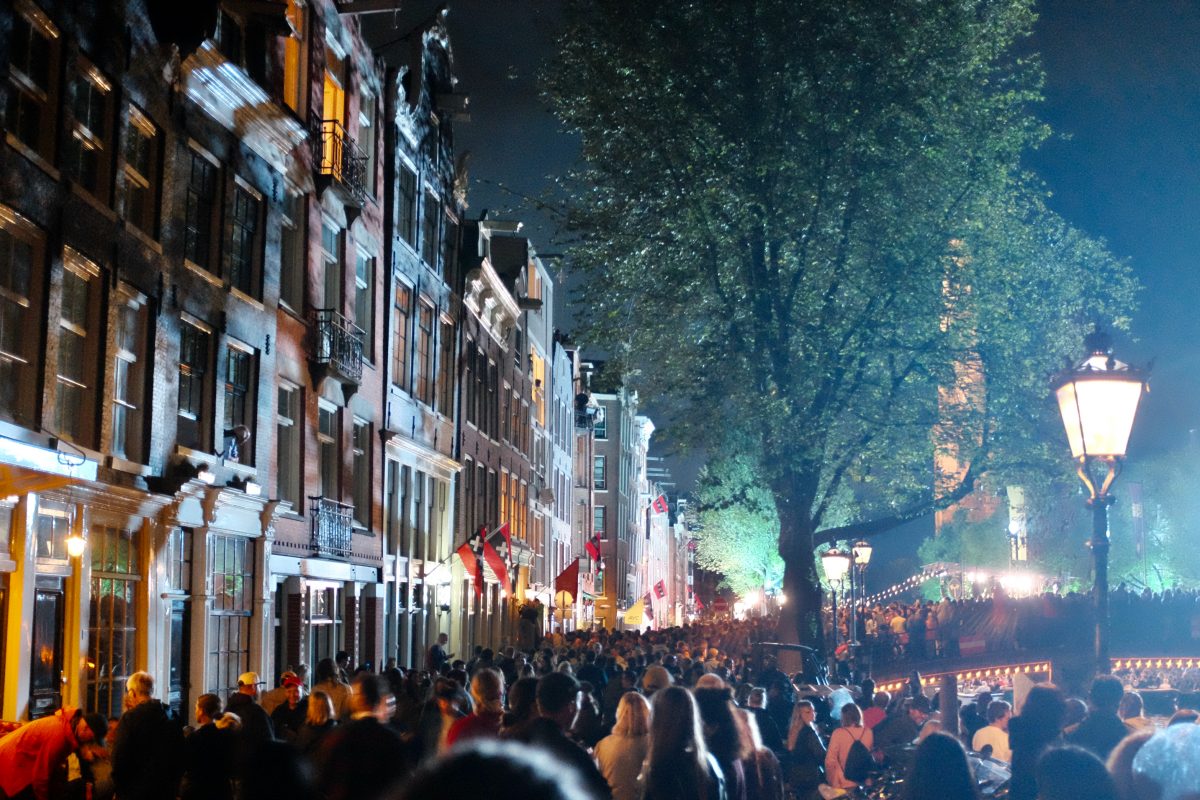
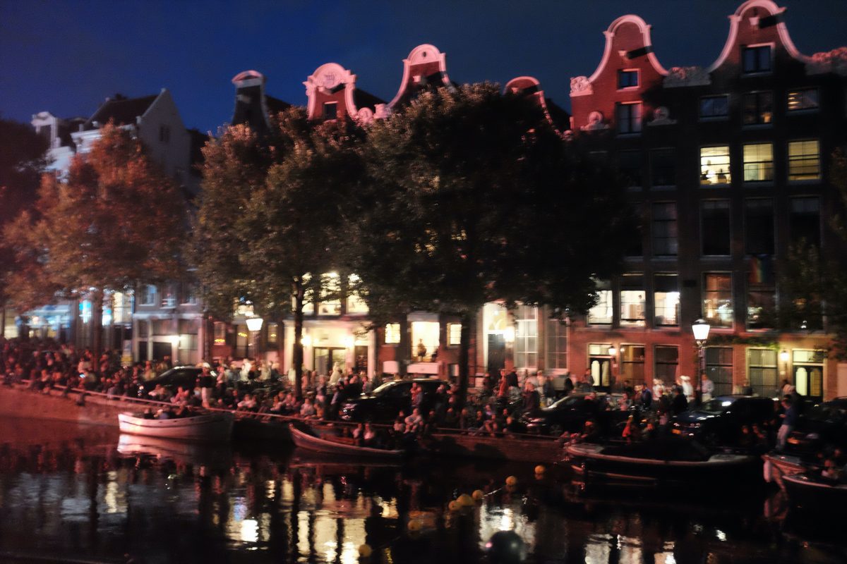
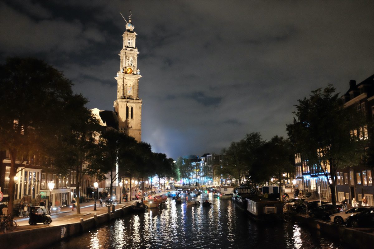
Prinsengracht Concert in Amsterdam
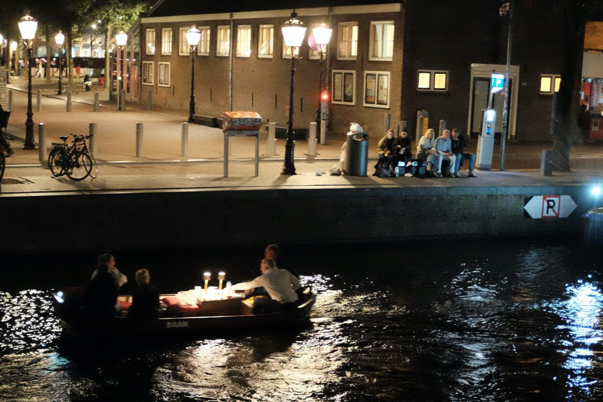
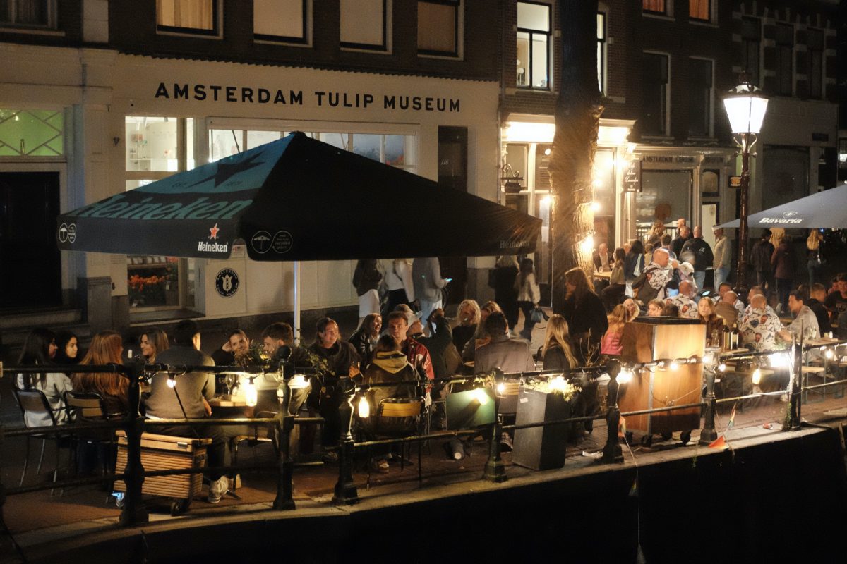
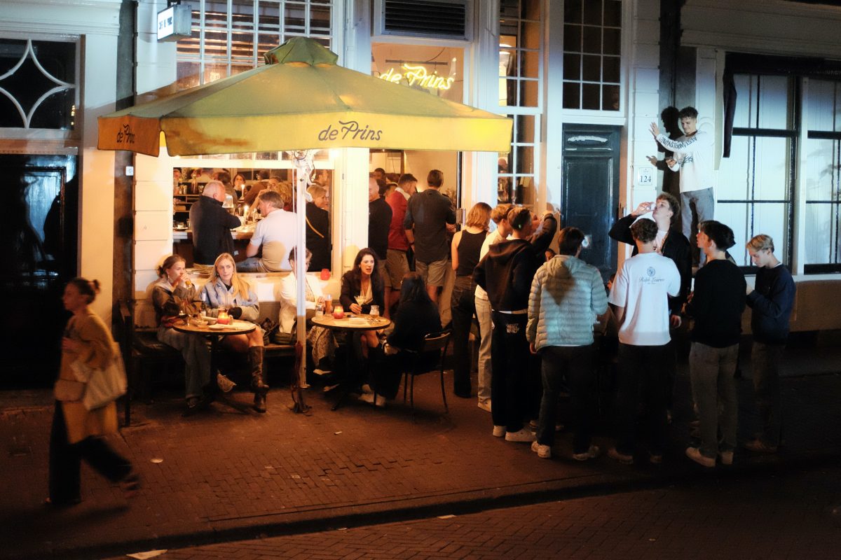
Once a year, the largest free classical music concert in the Netherlands happens on a canal on the Prinsengracht. A big orchestra is set up on a floating barge in the canal where the public can gather around for a night time serenade. The rich and influential Amsterdammers get front row seats on the water and anyone else who wants to see it has to camp out all afternoon to secure a good spot. There were so many people by the time we got there that we couldn’t get close enough to see anything at all, but at least we could hear it.
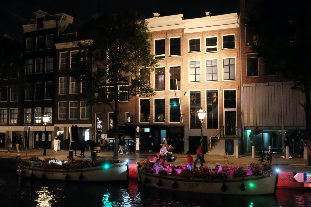
Anne Frank House
Day Trip to Delft
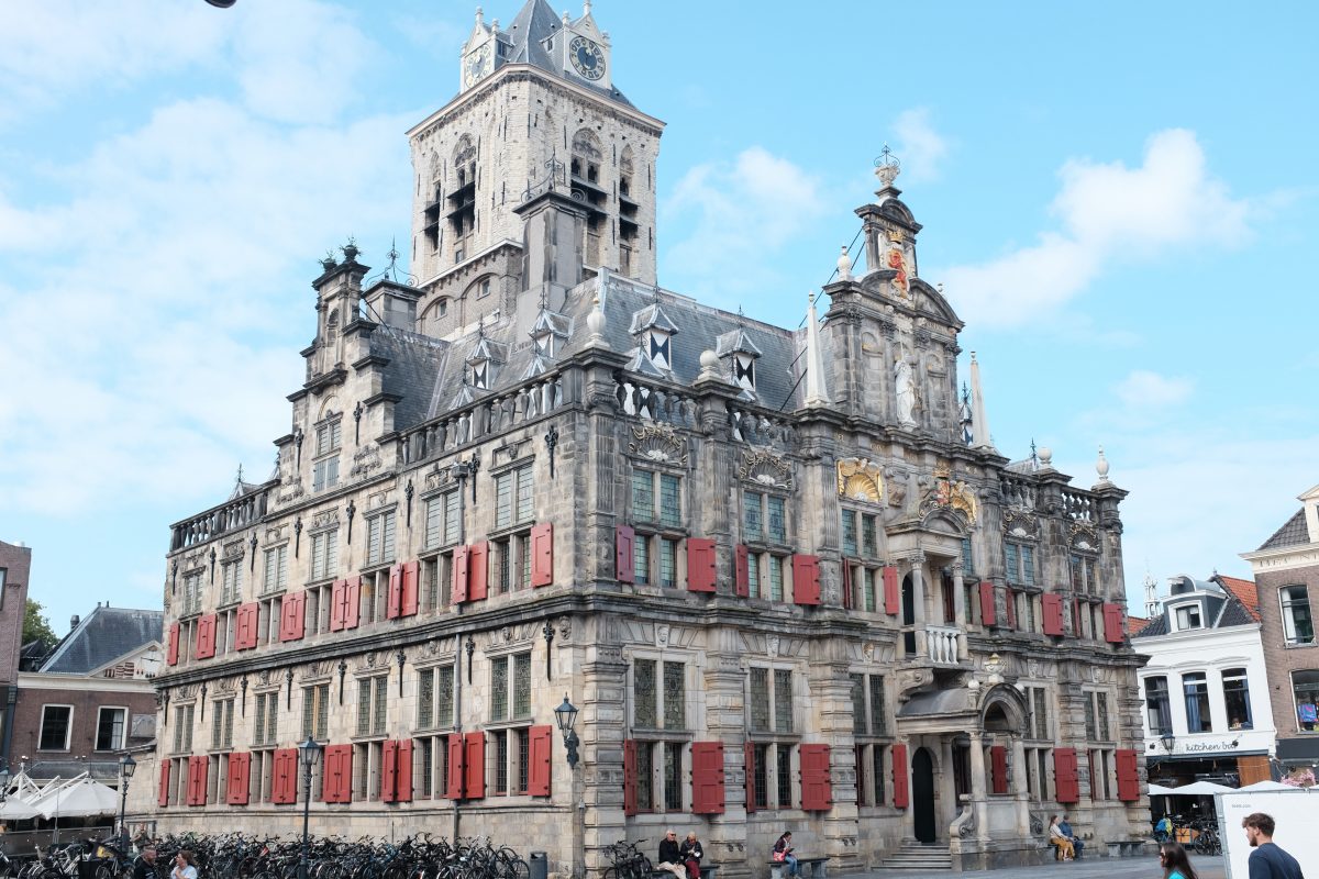
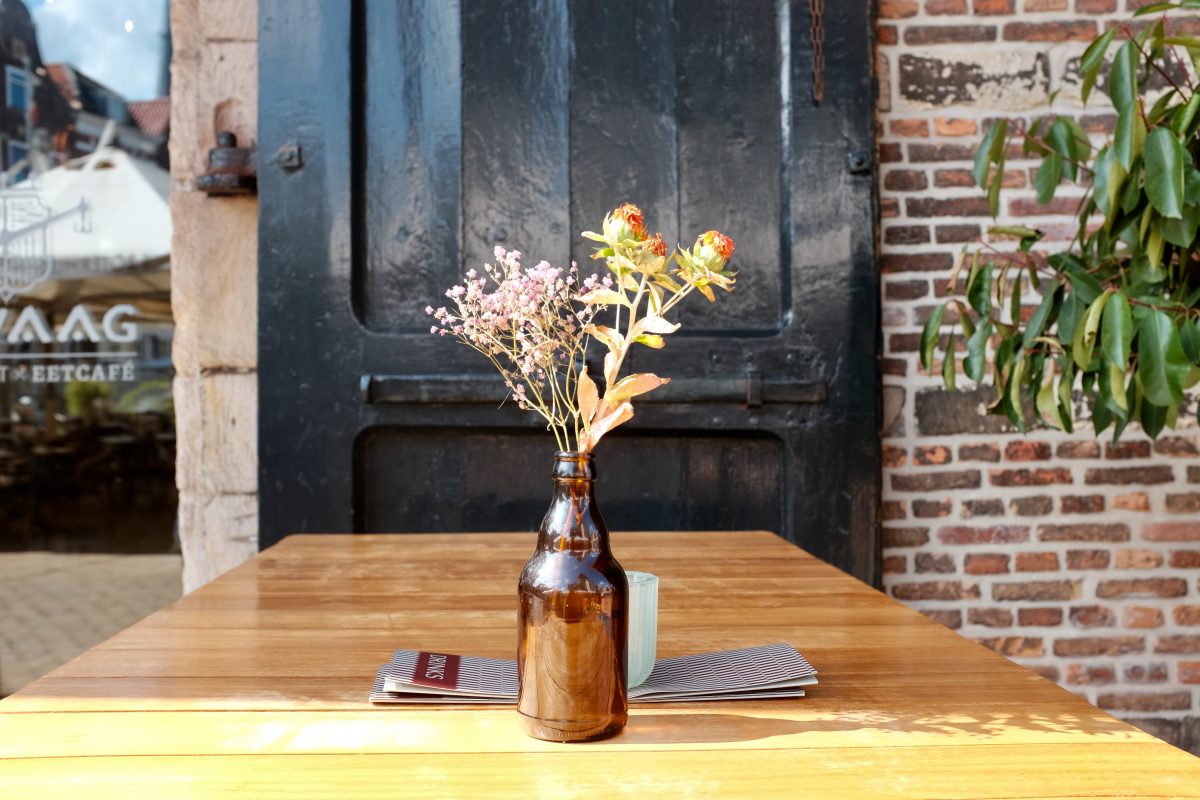
Delft is the centre of production for the famous Dutch blue on white Royal Delft Pottery. It is beautiful small town. Canals, bridges and bicycles…just like Amsterdam but on a much smaller scale. It has a slower feel to it too. Only 1 hour from Amsterdam by train, it is a nice place to spend a relaxing afternoon.
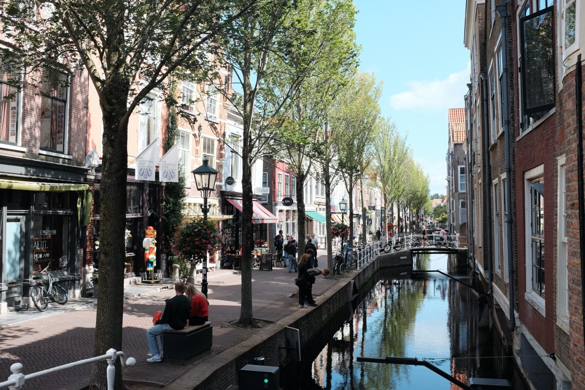
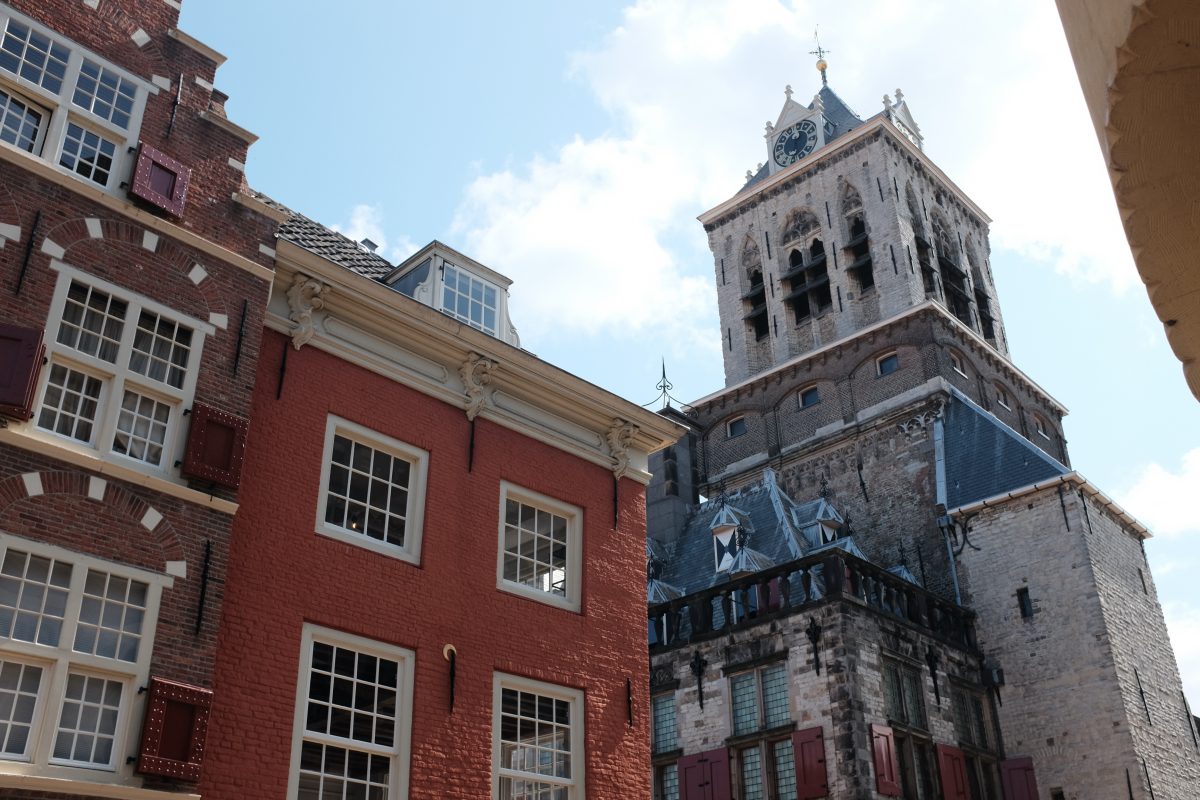
Goodbye Netherlands… hope to see you again someday.
To see the next post in this series CLICK HERE.
If you have any comments, questions or suggestions please leave them below. I always look forward to hearing from you.
If you enjoy the content and would like to contribute towards website maintenance and development, you can make a donation here.
Amsterdam
***please try to look at these photos on a bigger screen. Your phone will crush all the details***
This is the first post in a five part series. There is a link at the bottom to continue on to the next posts in chronological order.
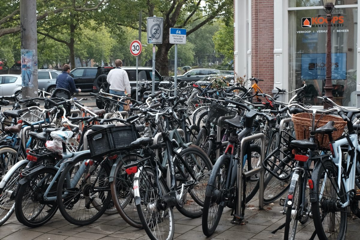
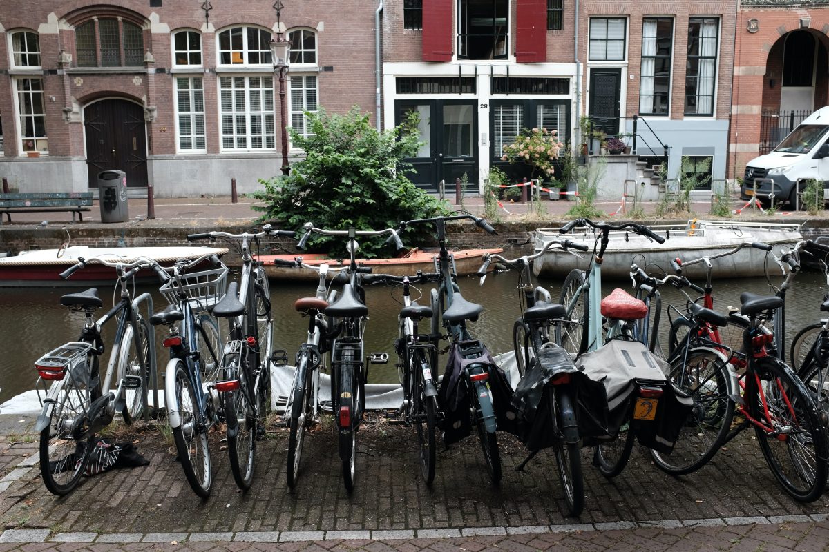
Bicycle Kingdom
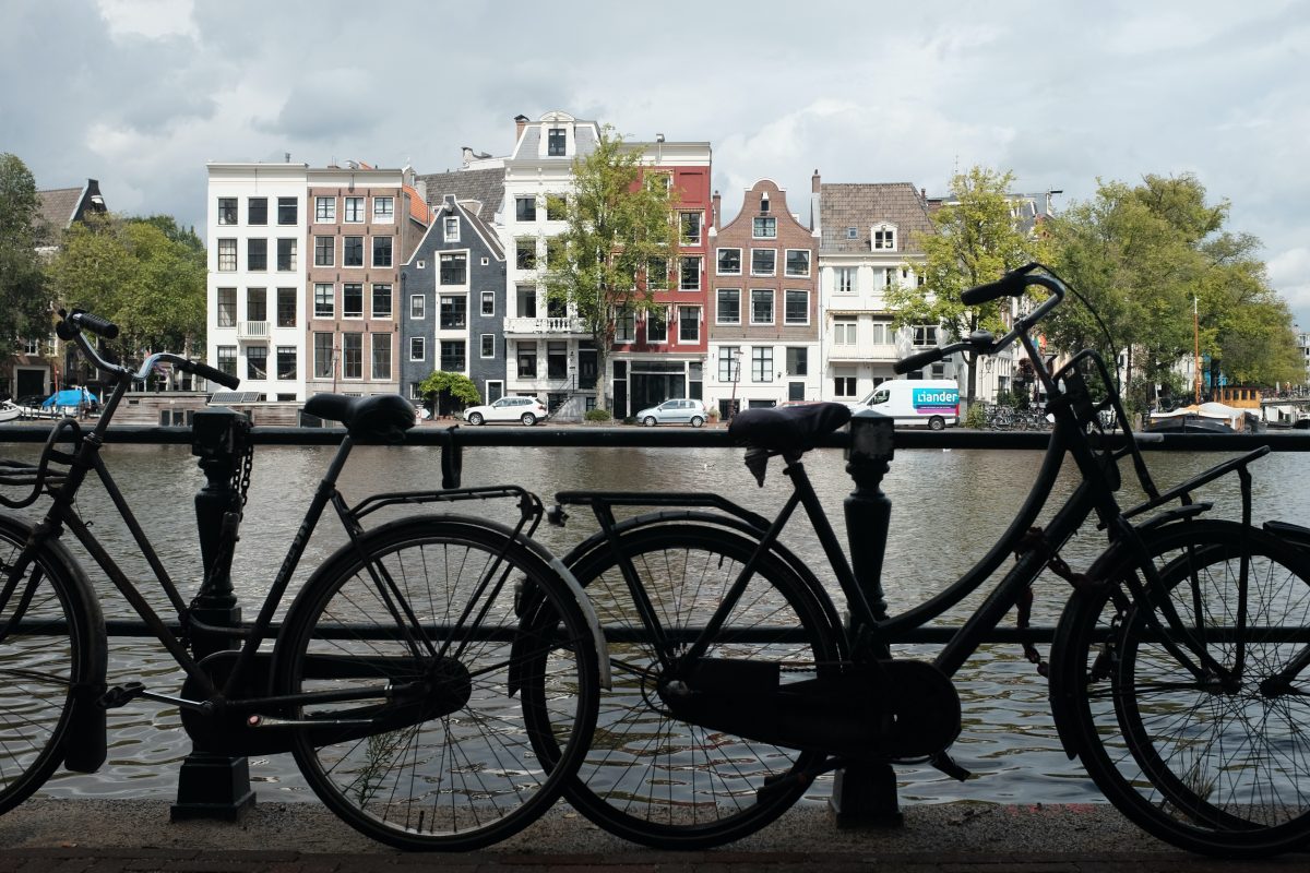
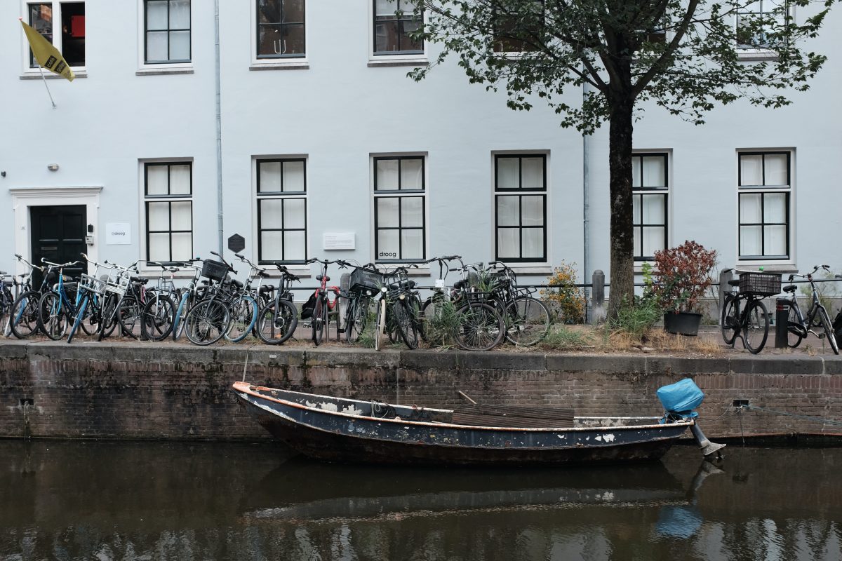
The first thing you learn as a tourist in Amsterdam is to watch out for bicycles. Bicycles have first right of way followed by public transportation then pedestrians and lastly, cars. There is long-established bike infrastructure here with separate bike roads running along every street, bridge and park. There are bikes everywhere. Everyone rides. And FAST! So, if you walk across a bike road without having a good look both ways, you might cause an accident. In the two days I have been here, I have seen near accidents a few times already. Usually it is a pedestrian unknowingly drifting into a bike lane, getting yelled at if they are lucky or run over if not. With locals, it is understood that bikes go first and they seem to have a second sense about how to get around through all the pedal traffic.
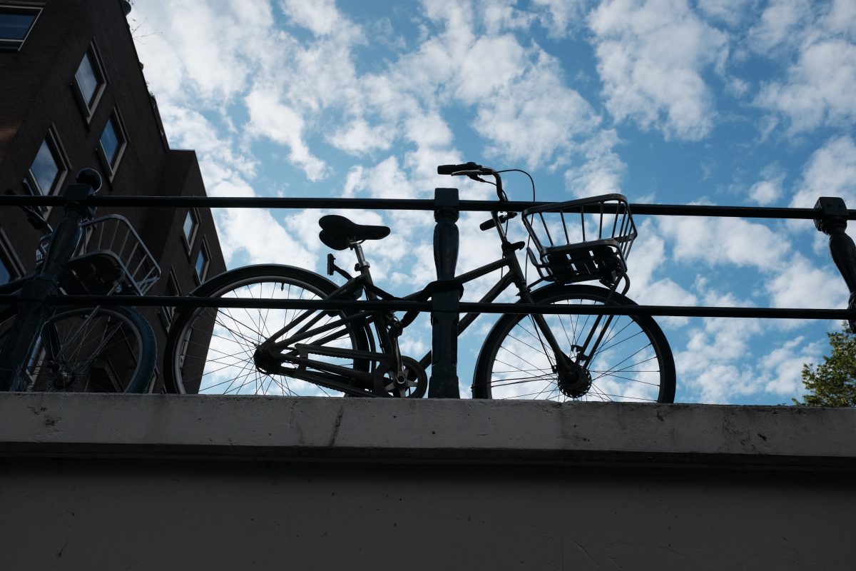
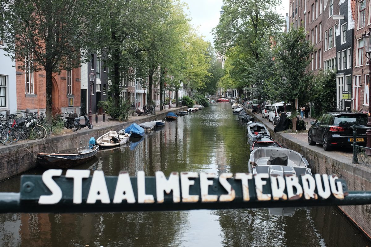
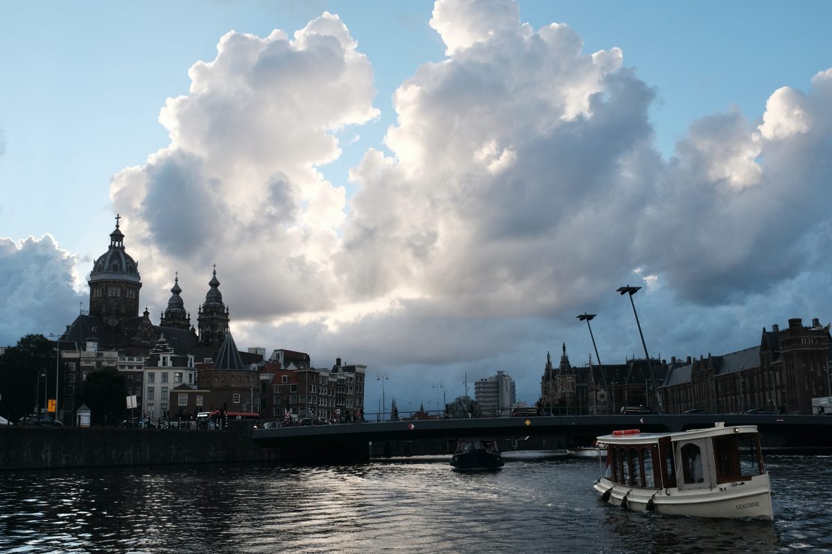
Canals and Bridges
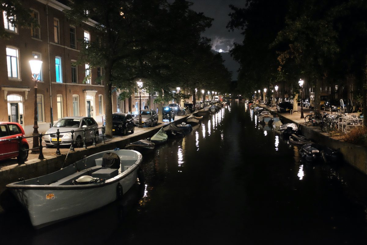
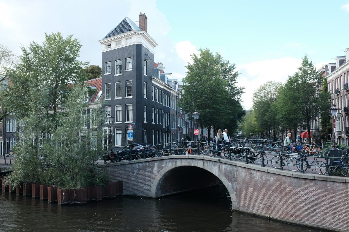
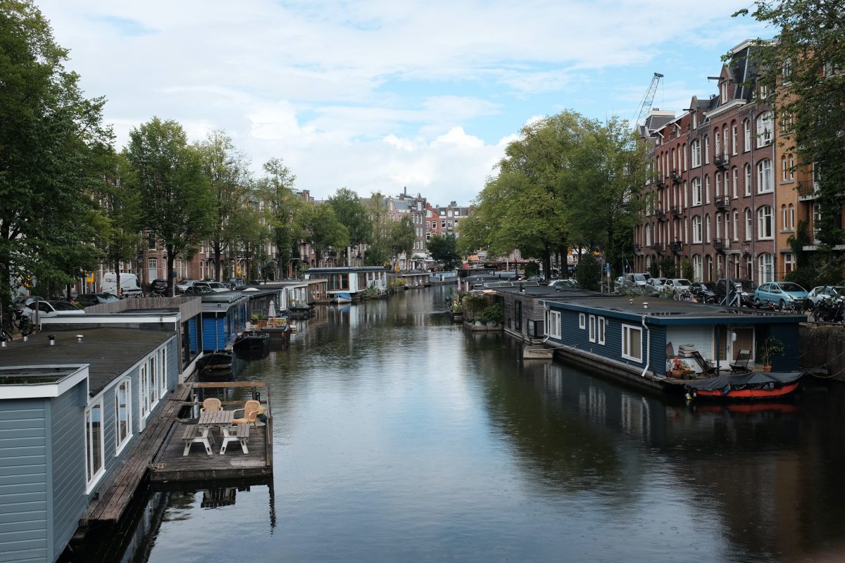
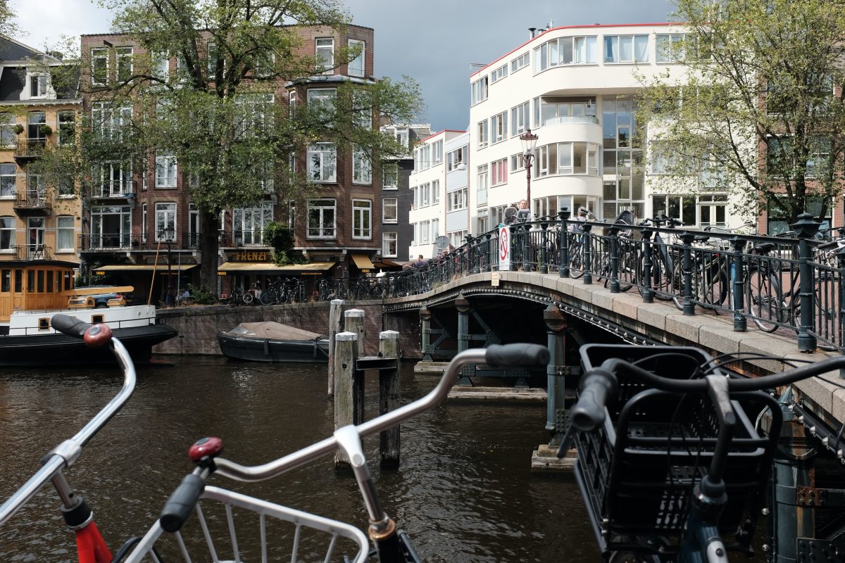
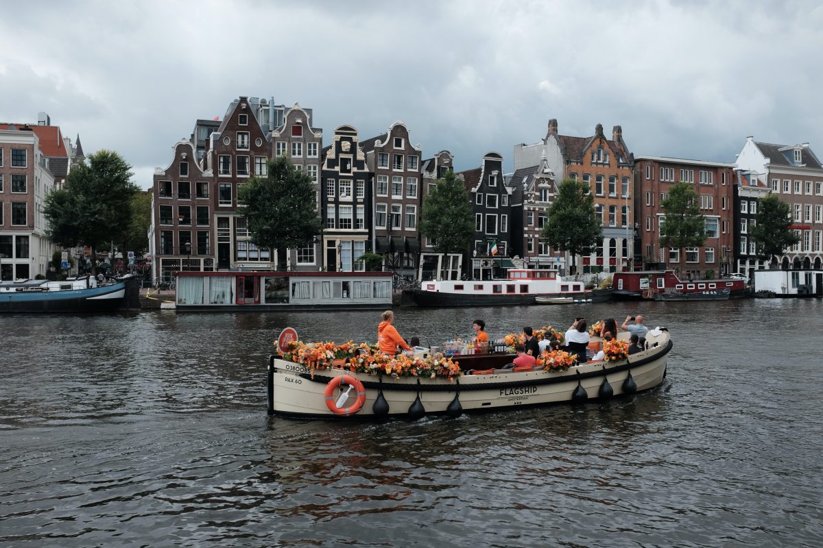
Amsterdam has around 165 canals with a total length of around 75km. And, there are over 1500 bridges crossing the canal systems.
Central Amsterdam Buildings
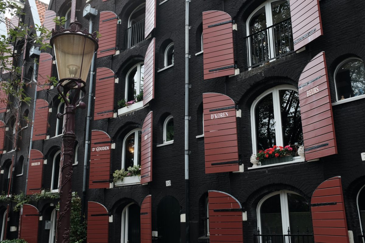
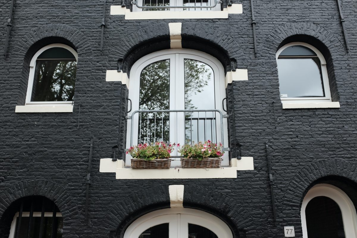
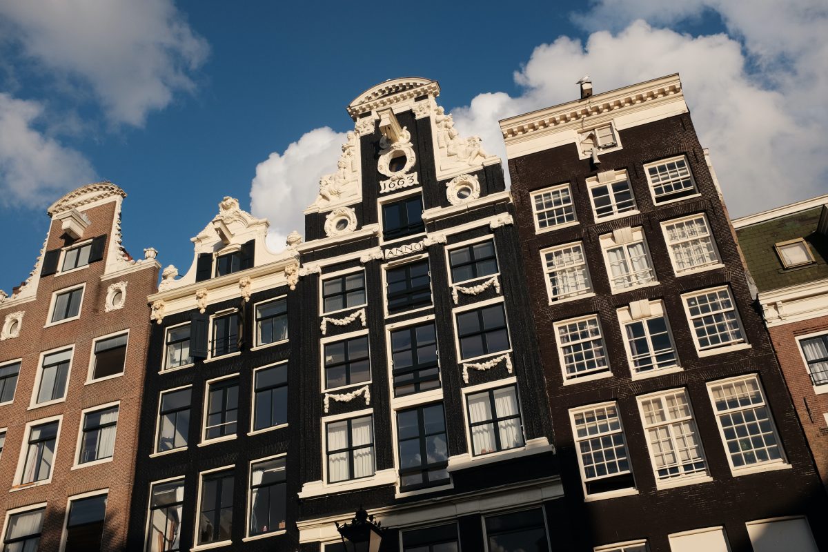
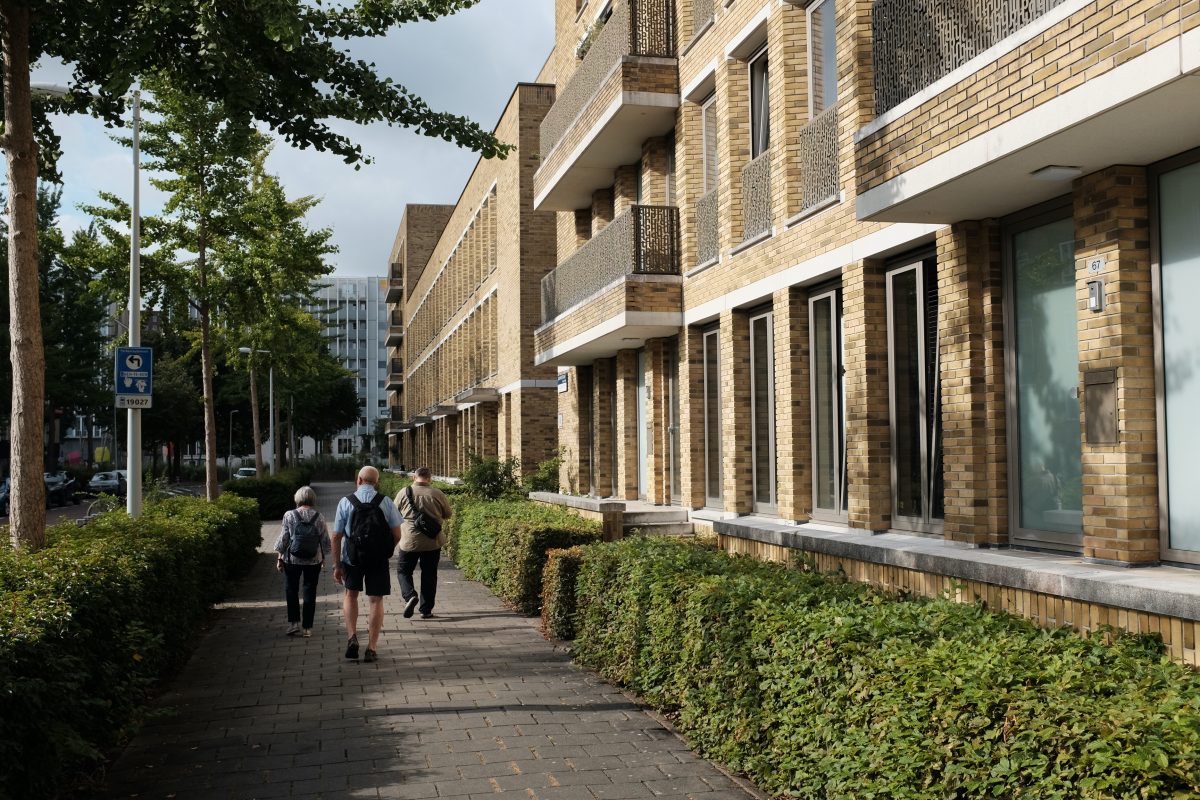
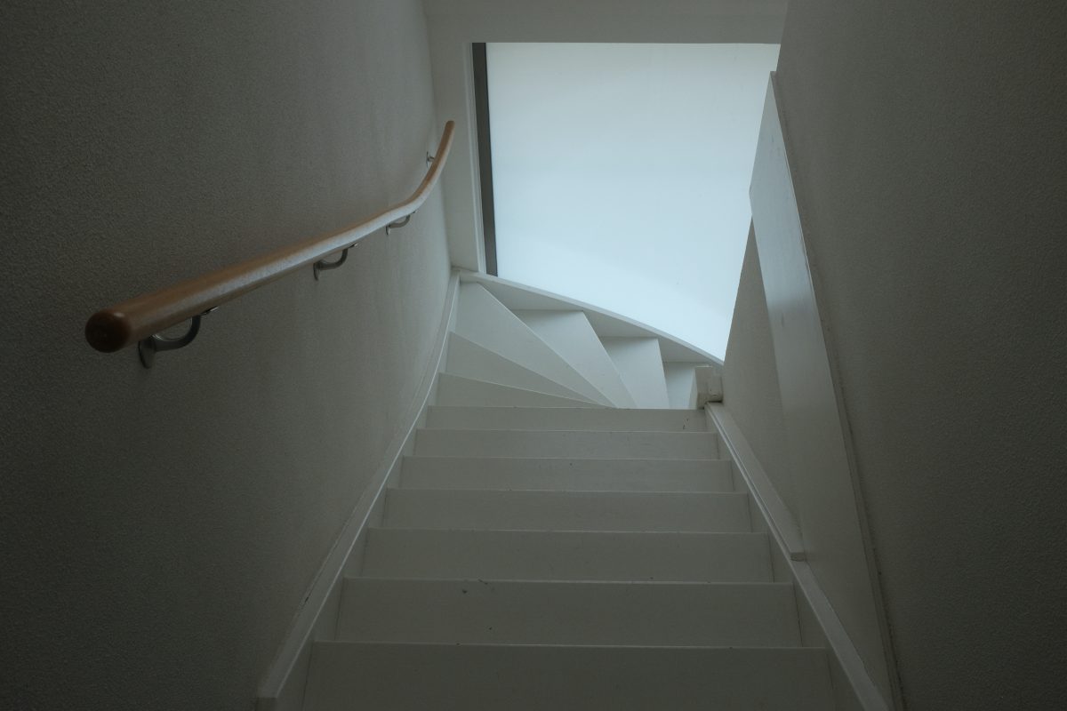
Although all of the buildings have unique details and no two look exactly alike, they all share a few similarities. Most are narrow and tall with big windows and steep staircases. There are no skyscrapers here. The tallest of the houses is probably four stories plus a small attic.
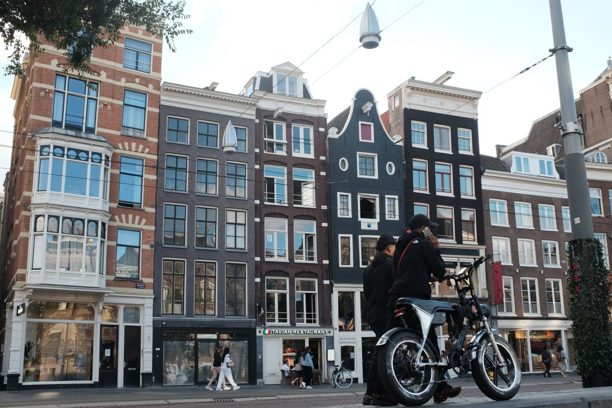
Old and New
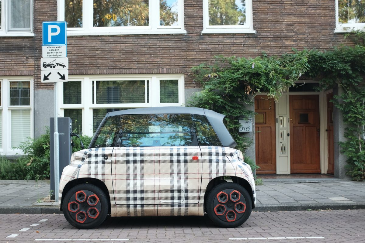
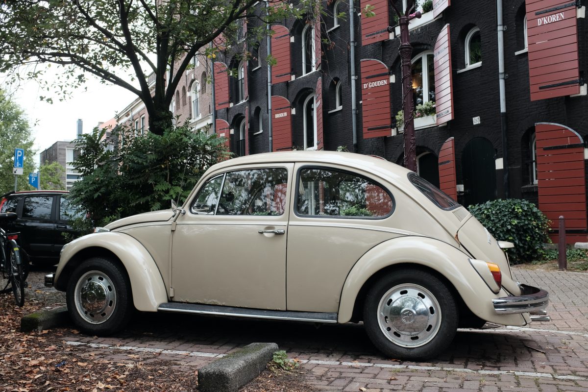
With it’s narrow streets and bridges, tight corners and swarms of bicycles, there is no room for large cars. Instead there are lots of interesting tiny vehicles (many electric) that you do not typically see in North America.
Travelling Partners:
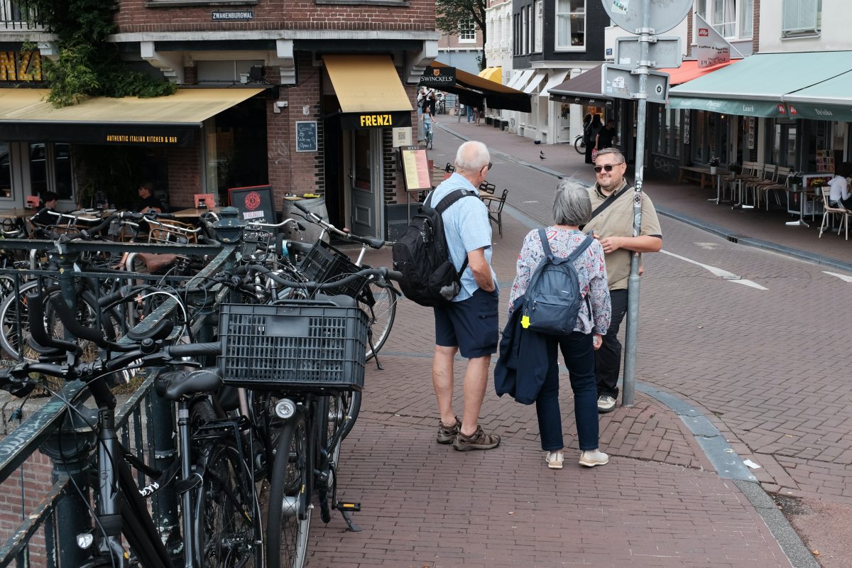
I am lucky to be travelling around the city with my good friend and his parents (who have no issues with walking non-stop 20km/day) …as long as there is a coffee and snack break here and there : )
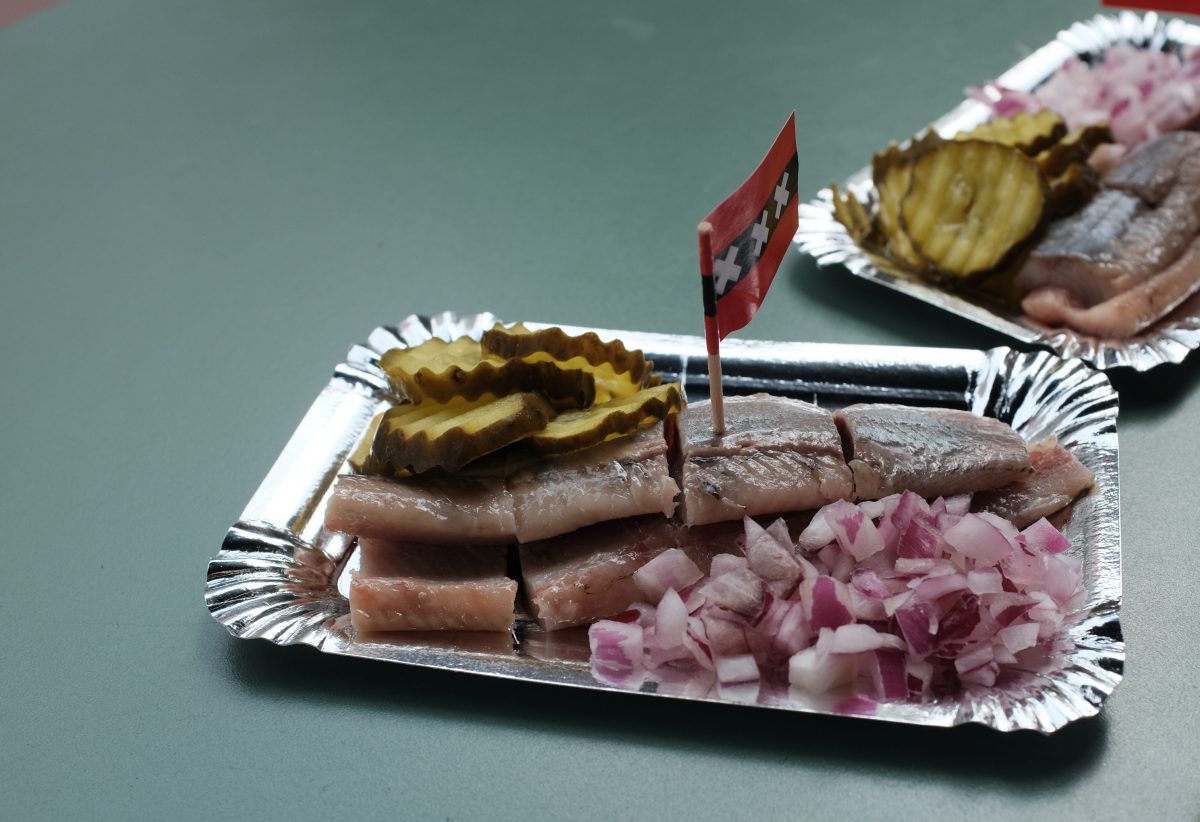
I asked one of the fish merchants how it is made. The herring season lasts for only a month in late spring/early summer. The fish are gutted and put whole into buckets of salt water and then frozen to -40 Celsius. Before serving, they are thawed extremely slowly and then hand filleted one at a time. Here they are served with raw onion and pickle. It is a unique and delicious fish preparation. I would recommend it to anyone visiting here.
Rain, Sun, Rain
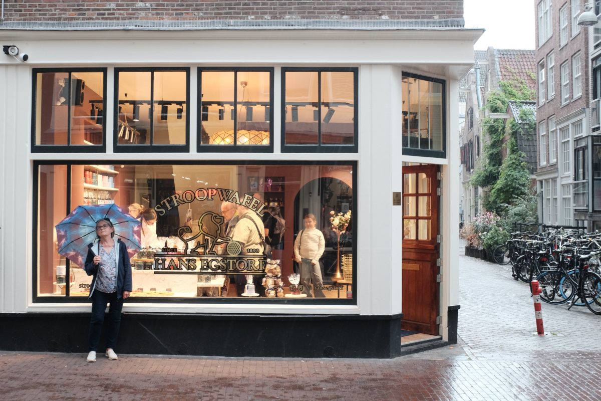
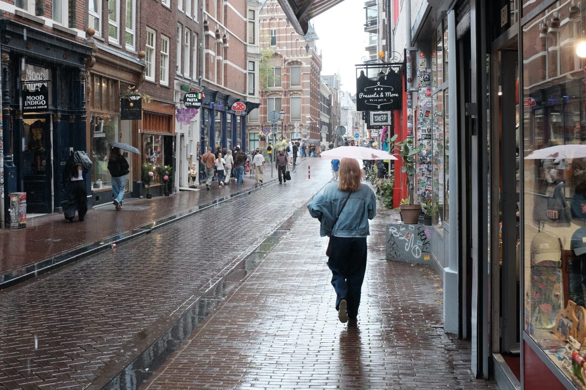
The weather here changes fast. It can be roasting and sunny for 10 minutes and then it clouds over and pours rain for 10 minutes and then back to blue skies just as fast.
Our Apartment
Public Transportation
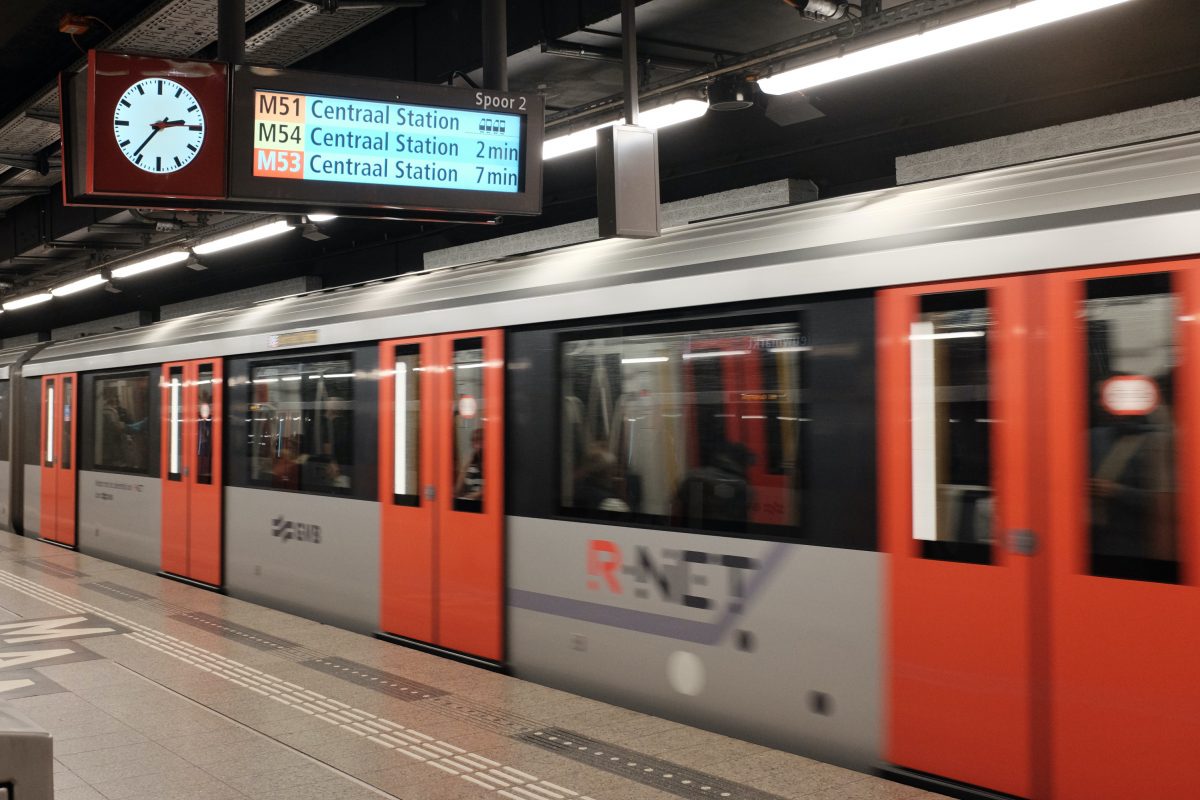
Subways, trains, trams and busses run between every point you can imagine. Amsterdam is a very easy city to explore on foot or by train.
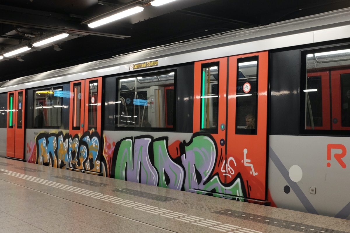
First Impressions of Amsterdam
Amsterdam is a highly functional city. There are people EVERYWHERE : pedestrians, cyclists and drivers but, even though there are almost no traffic lights, it all seems to work. The Dutch like to hustle along and they are good at it. Cyclists, pedestrians, cars, and trams all weave in and around each other through intersections at top speed and the natives understand and respect the system. As a visitor, it is all a little dizzying but also awesome to watch during the rush hour.
Even though it is so busy, it is relatively quiet compared to other big cities I have visited. There are very few private cars in the city centre with bicycles outnumbering cars by a huge margin. The air is noticeably fresh and clean. Many cars are electric and the government has mandated that all boats using the canal system must have electric motors within the next 2 years. Blasting music out of your store or boat is against the law. Police boats on the canal make sure that everyone complies with the rules and noise levels stay in check.
The overall effect is that central Amsterdam is a city where people can enjoy being outdoors together with almost zero noise or air pollution. I can spend hours walking through crowds on busy streets in the centre of the city and still come home feeling relaxed and refreshed.
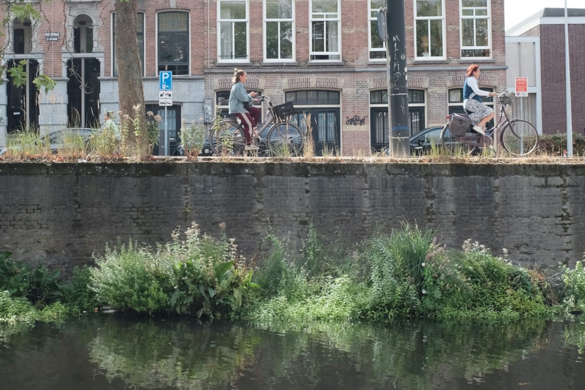
More Amsterdam to come….
To see the next post in this series CLICK HERE.
If you have any comments, questions or suggestions please leave them below. I always look forward to hearing from you.
If you enjoy the content and would like to contribute towards website maintenance and development, you can make a donation here.
Natural Spotlighting
***your phone will crush all the details in these photos. It is better to view this on a bigger screen***
Facing East
Every morning I make coffee and then sit at an old table to study or write. My cat hops up, curls into a ball, and sleeps beside me while I work and listen to chill music. This is my favourite time of day. At the opposite end of the room there are a few tall and narrow windows that let in the bright morning sun. This warm light filters in through the trees, slowly circles the room, and then gradually disappears. This scene changes a little bit every day and every season brings a new variation. I never get tired of looking at it. In the picture below, you can see what I see on a summer morning…
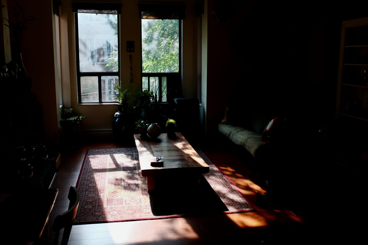
Natural Spotlighting
I began to notice moments when a ray of morning sun would pass through gaps between leaves and illuminate some small part of the room as if to say: “look at this!”. Whatever it touched would glow in this focused light. It reminded me of a spotlight on a dark stage, but made of sunlight. It was kind of a natural spotlight. I wondered if there was some way to capture this in a photograph. I was pretty sure that it wouldn’t be easy.
Technical Difficulties
When I set out to make these photos, I decided that I wouldn’t move things into a spot of light. The scenes would just have to happen on their own and it was my job to notice them and to try to capture them with my camera.
One problem was that the weather had to provide hard contrast between areas of light and shade. All of the photos below had to be taken from a shady area pierced by a strong beam of bright sunlight. Less than a big-blue-sky sunny day wouldn’t work for any of these pictures.
The bigger problem was getting my camera to see what I was seeing in my imagination. It took hundreds of photos and nearly two months to figure it out. The main subject is intensely lit, but because the photos are shot on very bright days, even the shade is full of light, So, if I exposed the spotlit subject accurately, the background would still creep into the photo.
Most of the problem was solved when I experimented with severely underexposing all of the shots (like 2 to 3 stops of underexposure!). This caused the shadows to fade to black and, as a bonus, added rich colour saturation to the main subject. This underexposure usually worked to produce the photos that I was imagining.
The Photographs
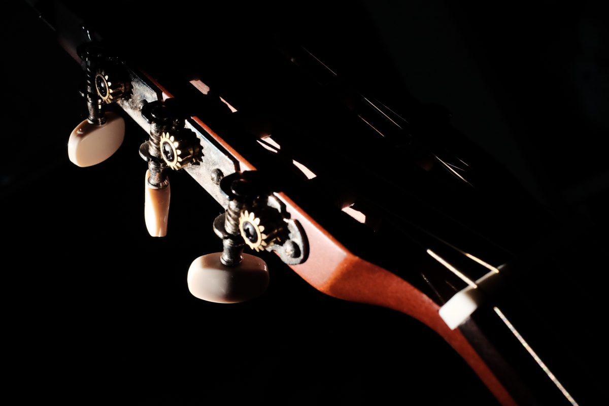
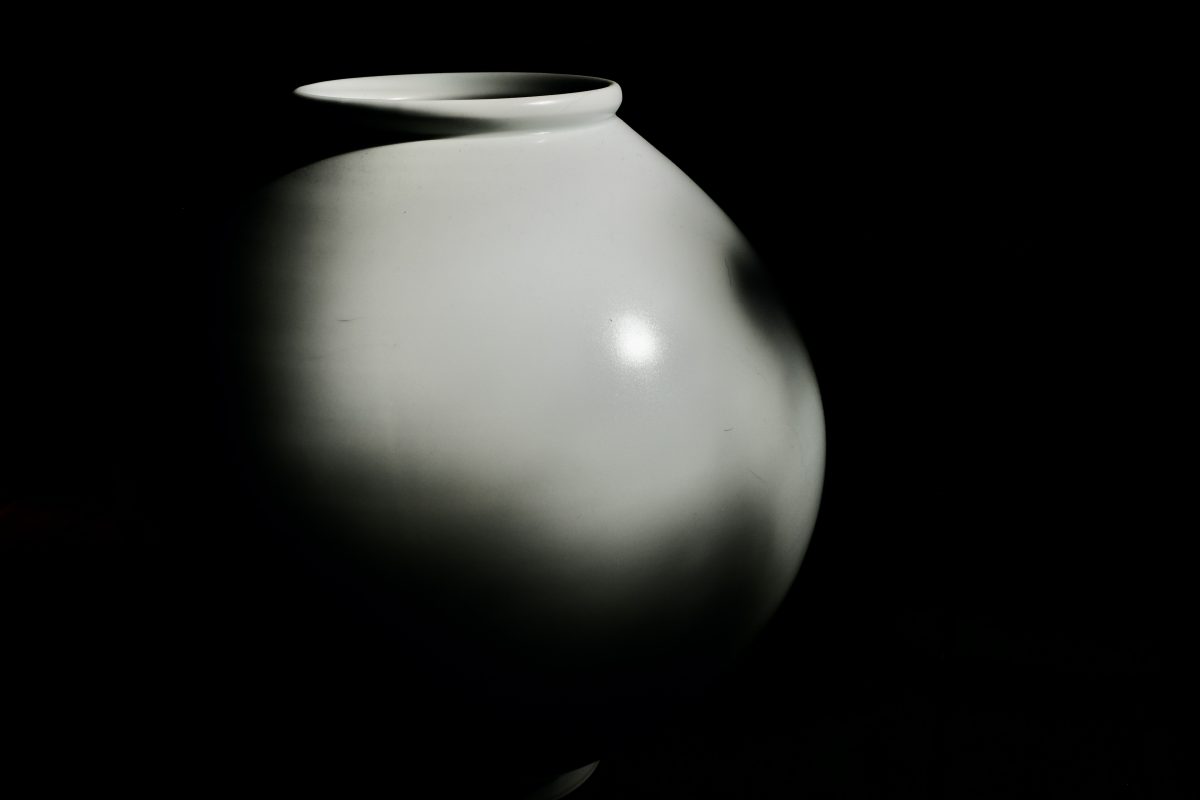

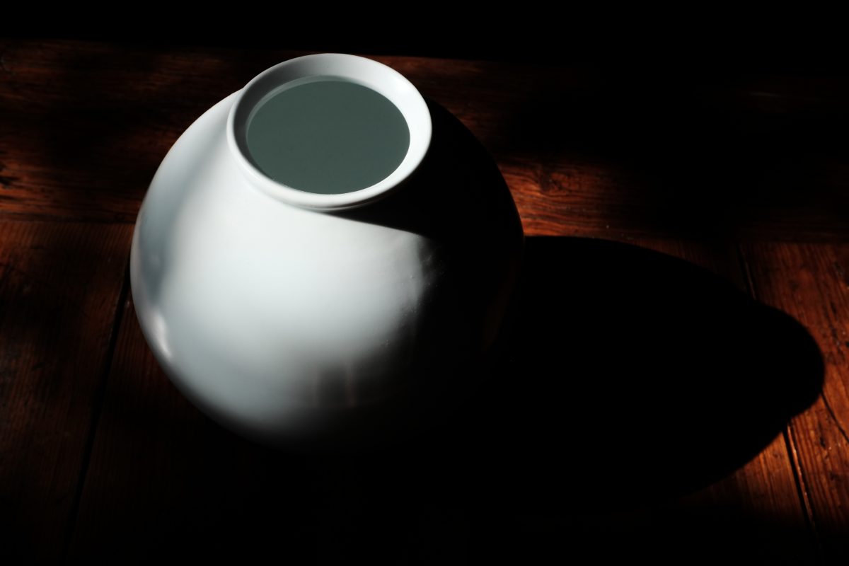

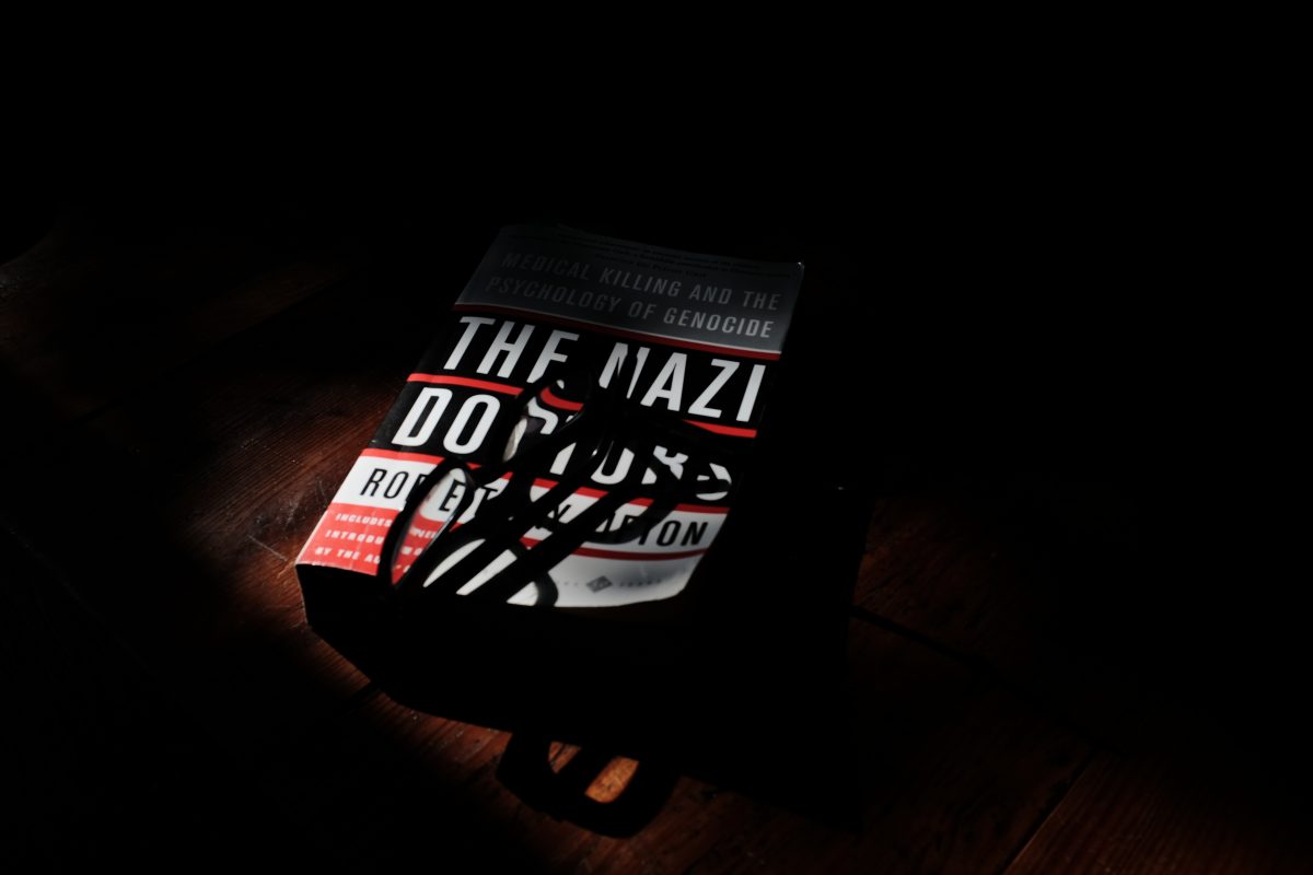
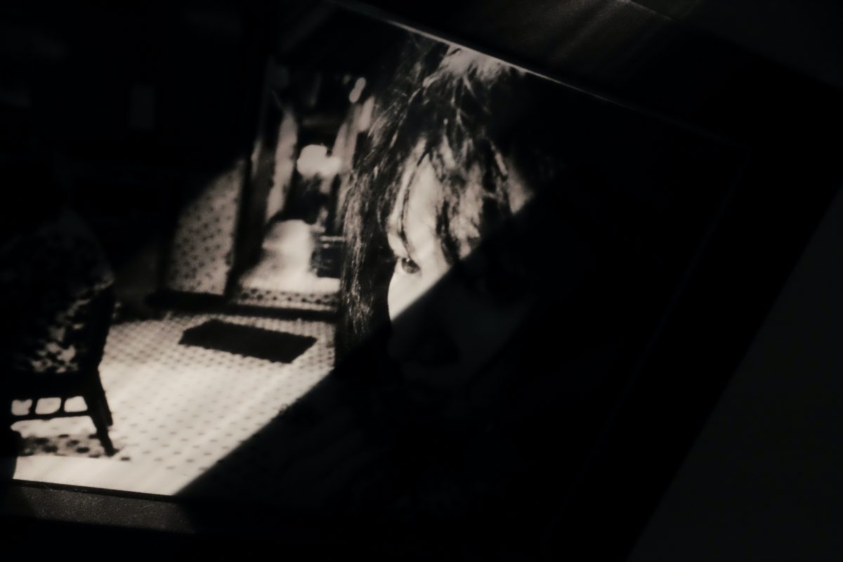
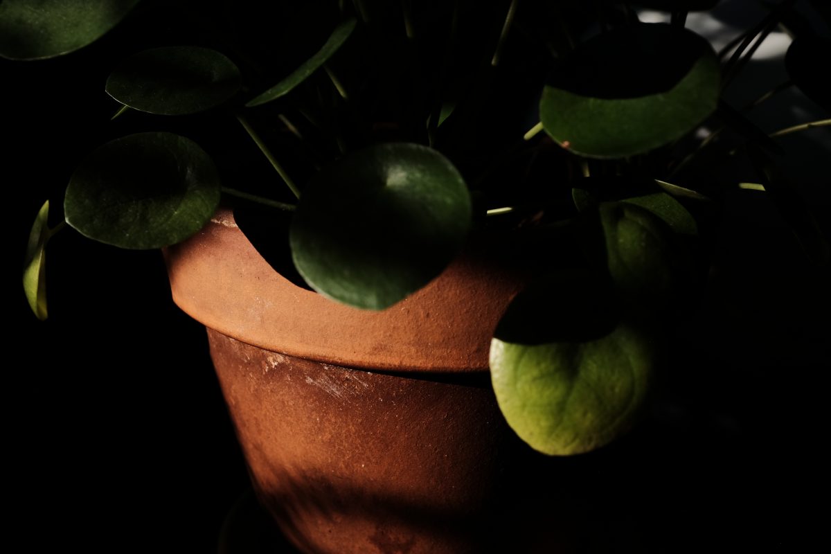
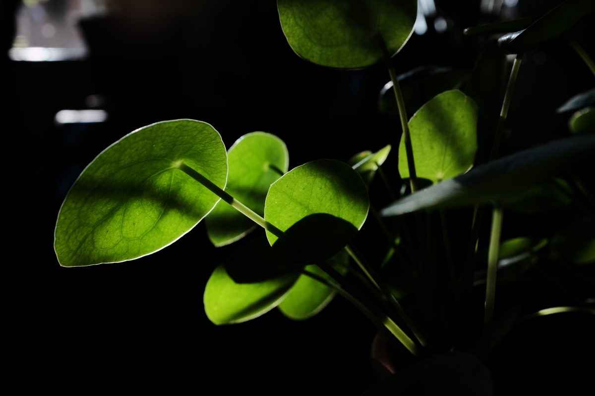
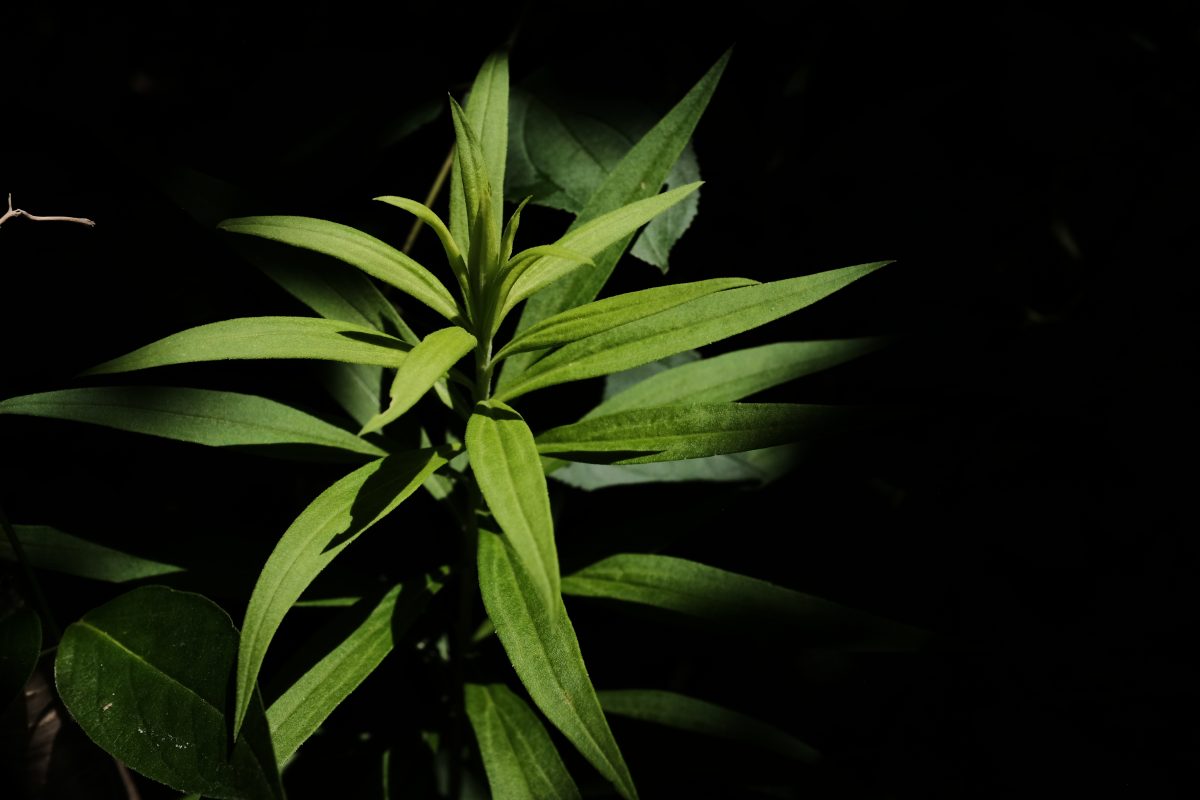
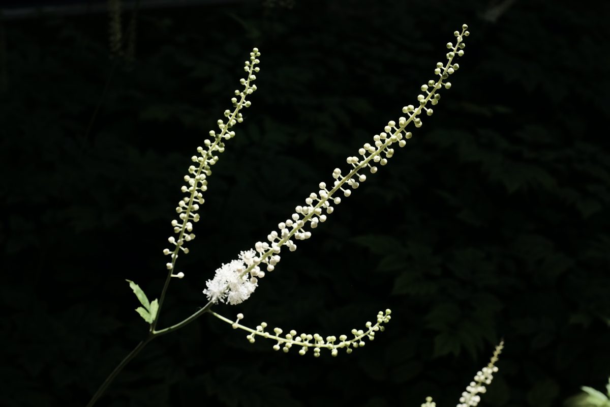
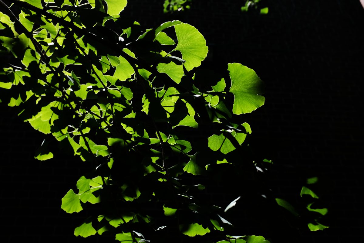
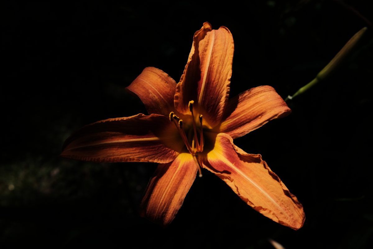
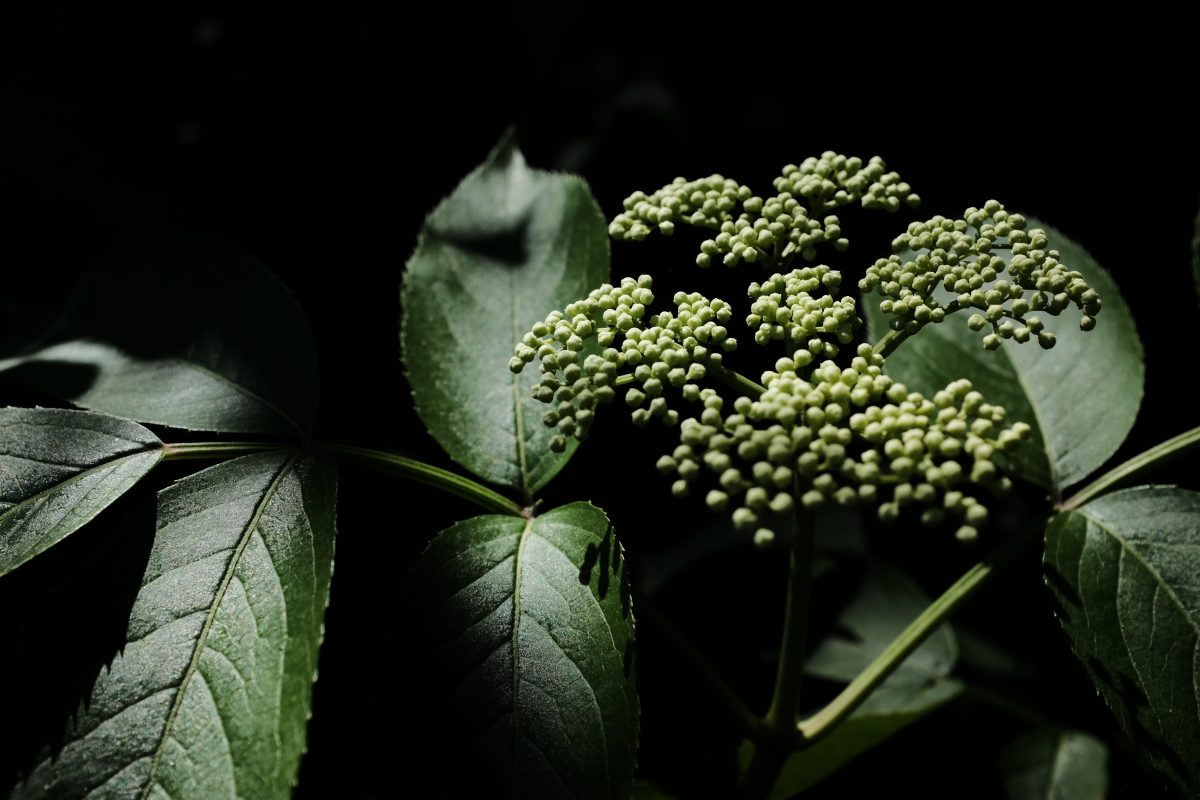
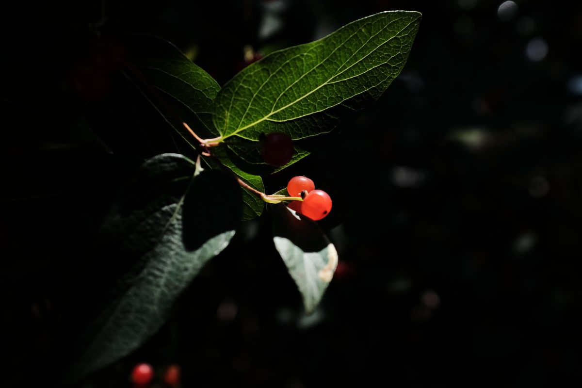
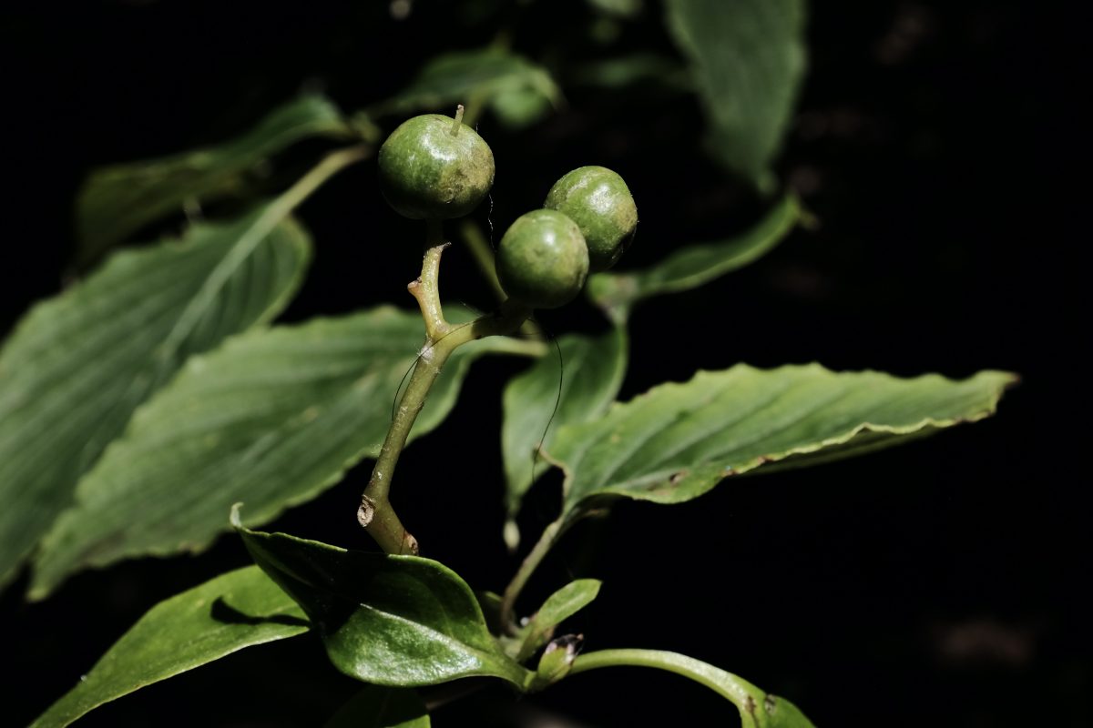
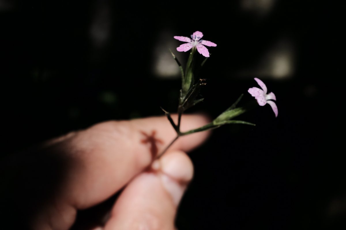
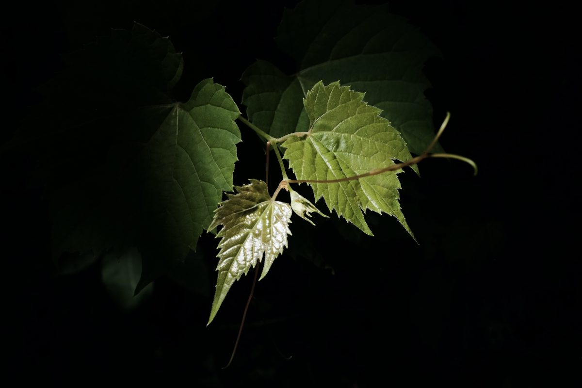
What John Irving said…
I once read an interview with the novelist John Irving where he said that his approach to writing is to start with the ending and then figure out how to get there. That’s where the hard work is. My approach to some photography projects is similar. I start with a specific mental image of a finished photograph and then figure out how to work with natural light and the camera to get there. This is never easy but I usually end of with something unique, something I haven’t seen before. If you are interested in seeing a couple of older photo projects that came about in the same spirit as this one, have a look here and here.
The images above are simple but making them was a challenge and I am happy with the way they turned out. I don’t do any photo editing other than some slight cropping sometimes. I try to get the photos that I want directly out of the camera. It’s not that i think that there is anything wrong with post-processing. It is just a different kind of photography and I don’t enjoy doing it.
I hope you liked these photos. If you have any questions or comments or if you know the names of any of the plants up above, please feel free to leave a message in the space below. I always look forward to hearing from you.
If you enjoy the content and would like to contribute towards website maintenance and development, you can make a donation here. Thank you for reading TigerSalad.